I've waxed nostalgia about games industry logo design a fair bit recently, but there's still one stone to turn in my quest to cover all logo bases: the logos of the games companies themselves. Let's hope there isn't a wasp under that stone, and it runs out and stings me!
Just so you know: this article doesn't mention wasps. It's literally just about games company logos. Please don't mistake it for one of those articles about wasps.
Just so you know: this article doesn't mention wasps. It's literally just about games company logos. Please don't mistake it for one of those articles about wasps.
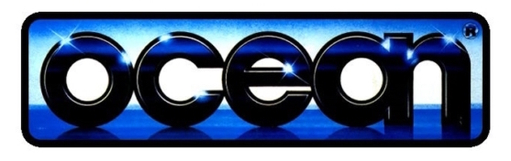
Without a doubt, my favourite software company logo of all time, the Ocean logo is a superb piece of design - courtesy of Ocean cover artist Bob Wakelin; the undisputed king of 1980s airbrushed cover art.
The deep blues, the curves of the lettering, the way the A and the N are conjoined... the subtle flares of light. It's properly lovely, and it worked just as well as a flat, two-colour image.
The deep blues, the curves of the lettering, the way the A and the N are conjoined... the subtle flares of light. It's properly lovely, and it worked just as well as a flat, two-colour image.
I'm not trying to be facetious when I say that I always felt the US Gold logo looked a bit cheap. I get what they were going for - trying to make it look like a slab of gold bullion - but the colours just rendered it a bit tacky.
It also didn't help that the lettering and the background were shades of the same gold/yellow - which made it ugly, and difficult to read at a distance.
It also didn't help that the lettering and the background were shades of the same gold/yellow - which made it ugly, and difficult to read at a distance.

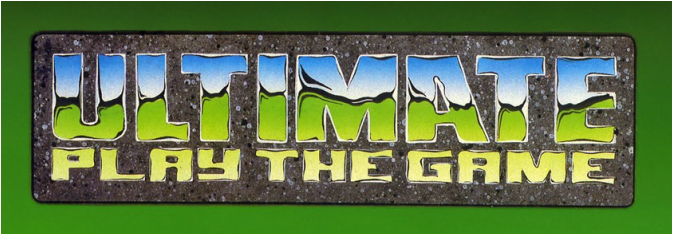
For many, this is the logo which defined the 80s. Given how iconic it is, it's surprising to realise how basic the actual design was, and how it was heavily dependent upon that lovely airbrushing.
Take away the chrome, and there's very little about it which is iconic - save perhaps, for the slanted A. When I got my first job as a graphic designer for Ladbrokes Racing, I was forever trying to recreate Ultimate's chrome look.
The graphics technology we had at Ladbrokes was a step up from teletext software, but still incredibly limited. I gave it my best shot, mind.
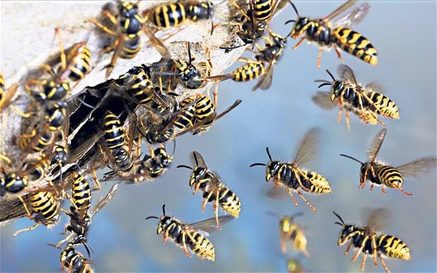
Obviously, this isn't a games company logo: it's a wasp. Just a wasp. It has no place being in this article, and is here to remind you that this article is definitely not about wasps. Just please bear that in mind as you go through it.
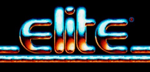
Elite is still going, and the company continues to use its classic logo - appropriate given that these days it mostly specialises in retro gaming for smartphones. It's not a bad logo - looking like drips of molten metal, on the floor of a steelworks - but it looked a bit fragile. The curves made it feel homespun and a bit amateurish somehow.
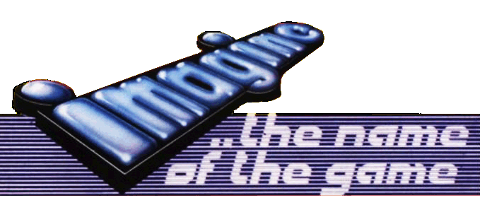
Imagine was bought out by Ocean in 1984, but the company continued to use the Imagine brand for some years afterwards. Whereas Imagine famously ran itself into the ground, swamped with debt and the behaviour of the idiots, they didn't do everything wrong: the logo remains my second favourite of the era, just after Ocean.
It's not even particularly chrome-y; I just like how tactile it appears - I could imagine running my fingers or lips over it. That might sound a bit weird, but... well... it is what it is. At least I didn't say I want to lick a wasp, or something!
It's not even particularly chrome-y; I just like how tactile it appears - I could imagine running my fingers or lips over it. That might sound a bit weird, but... well... it is what it is. At least I didn't say I want to lick a wasp, or something!
Just in case you'd forgotten what it is that you're not reading about - here's another picture of a wasp. Again, please do not mistake this article about games company logos as an article about wasps. That road will only lead to disappointment. You might want to write that down, so you can refer to it as you continue reading.
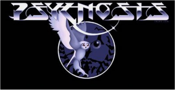
Born from the ashes of Imagine, Psygnosis was another company which eventually got swallowed - this time by Sony, who closed down the Liverpool-based studio relatively recently. Though later responsible for Wipeout on the PlayStation, the brand remains synonymous with the Amiga for me.
In part, this is entirely down to the logo - designed by prog rock cover legend Roger Dean - who also inspired the visual look of the Amiga classic Shadow of the Beast.
It's cold, it's clinical, and virtually impossible to read on first glance, and it has an owl in it - yet it's a masterpiece. But then, I would say that being a shameless prog rock fan. Though that said, I've never much liked Yes. Perhaps they should've changed their name to "Yes?", to which I would've replied "No thanks!".
Incidentally, talking of bands... this article isn't about the heavy metal band W.A.S.P. either, and nor will it ever be. What a wretched quartet of twats they were.
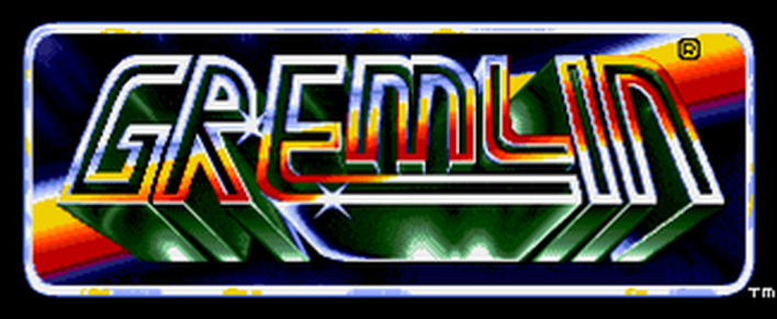
As loved as Gremlin were - and still are - this logo makes me feel a bit sick. Far too fiddly, and the colours make me think of disease, or decaying fruit, or a rotting frog.
See the many wasps. "Why will nobody make an article about us?" they cry in unison. Sorry, guys - this is an article about games company logos!

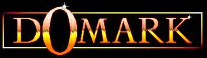
This has much the same effect for me as the US Gold logo. The spindly font is clearly aiming to be classy, but it just looks weak. Evidently, they made a stab at a chrome effect, but it's hopelessly done. And what's with that big O? It looks as if you're about to have your face sucked on by an alien Muppet. Ma-nah-ma-nah.
This is where the wasps live. It's rubbish. It hasn't even got any windows or a garden, and probably doesn't even have wifi. Consequently, I'm not going to be mentioning it in this article. Why would I? It's an article about games company logos, stupid!

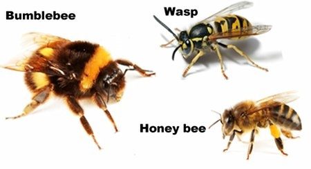
I know it can be hard to remember everything when you're being subjected to new information, so here's a handy chart that you might like to print out and keep beside you.
It's a chart showing a wasp, and two other things: a type of fat wasp called a bumblebee, and a honey bee - another type of wasp, with a furry thorax. None of these wasp-types will be featured in this article. That is the purpose of this chart.
It's a chart showing a wasp, and two other things: a type of fat wasp called a bumblebee, and a honey bee - another type of wasp, with a furry thorax. None of these wasp-types will be featured in this article. That is the purpose of this chart.
Codemasters were either ahead of their time, or woefully behind it, with their first attempt at branding. It harkens back to the 70s, looking like the logo of a fictional glam rock band from a kids TV show. "Hey, kids! We're the Code Masters, and this one's called Crystal Kingdom Dizzy!"
Here's the letter W - the letter of the wasp. Though wasps aren't a part of this article, the letter W can be found throughout the remainder of it.
Should you notice this, please don't mistake it as an indication that I am about to begin talking about wasps. The letter W can be used for many different purposes, and I have no intention of featuring wasps in this article. I can't state this enough.
Should you notice this, please don't mistake it as an indication that I am about to begin talking about wasps. The letter W can be used for many different purposes, and I have no intention of featuring wasps in this article. I can't state this enough.
By the late-80s, the games industry had started to grow up, and the company logos reflected that. While, ironically, not reflecting anything else - the chrome look mostly falling out of favour by this point.
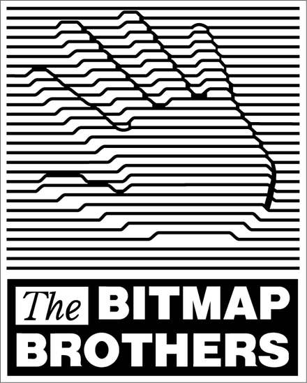
Strangely, while The Bitmap Brothers' graphics were all about that chrome-look airbrushing, they decided that the company logo should have no truck with such things, and fall in step with the prevailing winds.
It's pretty iconic - you could see the hand as the cover of a Joy Division album. Actually, Joy Division is precisely the sort of name you could imagine a 1980s games studio having.
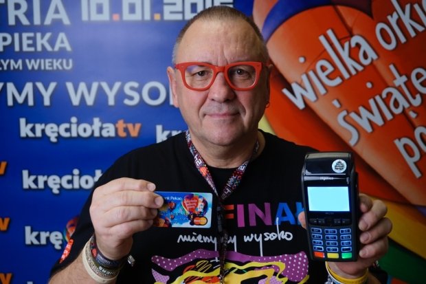
Look at this feller, with his red glasses and card reader. I bet he takes that thing around with him everywhere he goes. "Just put your card in the reader," says the cashier. "Actually," he replies smugly, "I've brought my own."
Anyway, he has something to do with The Wielka Orkiestra Świątecznej Pomocy - or WOSP, a Polish charity. While the WOSP isn't the same thing as a wasp, please don't fall into the trap of thinking that the WOSP is going to be the focus of this article, when really it's all about games company logos.
Anyway, he has something to do with The Wielka Orkiestra Świątecznej Pomocy - or WOSP, a Polish charity. While the WOSP isn't the same thing as a wasp, please don't fall into the trap of thinking that the WOSP is going to be the focus of this article, when really it's all about games company logos.
While not wishing to confuse matters further, this is a logo for a wasp - but this isn't an article about logos for wasps. It's an article about another type of logo: games company logos. I would hope by now that this has become abundantly clear.
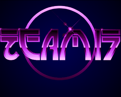
The Team 17 logo felt like it straddled two eras - paying homage to the airbrushing of the 1980s, while throwing forwards to the computer design of the 90s. It's a lovely logo, of the sort you'd only see nowadays on a holographic computer read-out in something like Mass Effect or Halo.
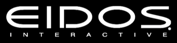
And here we have a logo that's pretty typical of everything that followed. Eidos is gone now, but that logo paved the way for everything to get very corporate and sober.
Say what you like about Electronic Arts, but they've stuck with their EA logo for years now - and it remains one of the most immediately recognisable brands in gaming. It's hideously corporate, but it serves its purpose.

I get why things have to change, and why the games industry had to mature. I don't yearn for old games company logos in the way that I wish the games themselves had more distinctive logos.
Nevertheless, I do miss the days when the company logos leapt out at you from the packaging, like an old friend bursting from a bush. You look at most modern corporate logos and you might as well be looking at a Shutterstock image of a board meeting, or a financial returns spreadsheet.
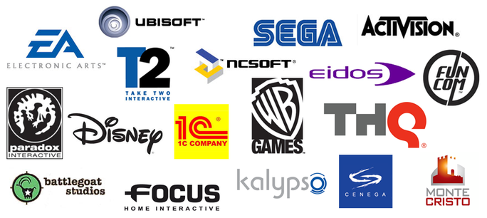
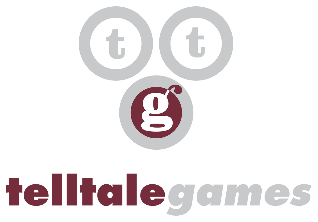
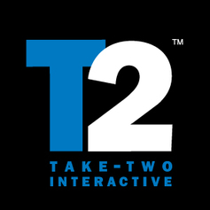
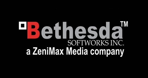
How many of today's games company logos can you describe? What about the Ubisoft logo, or the one for Take Two Interactive, or Bethesda? What about Square Enix, or Rovio? It isn't that I want a return to the chrome and airbrushing of yore - I just want designers to look beyond the fonts and Adobe options that are right in front of them, and dig a little deeper into their imaginations.
Nevertheless, I do miss the days when the company logos leapt out at you from the packaging, like an old friend bursting from a bush. You look at most modern corporate logos and you might as well be looking at a Shutterstock image of a board meeting, or a financial returns spreadsheet.
How many of today's games company logos can you describe? What about the Ubisoft logo, or the one for Take Two Interactive, or Bethesda? What about Square Enix, or Rovio? It isn't that I want a return to the chrome and airbrushing of yore - I just want designers to look beyond the fonts and Adobe options that are right in front of them, and dig a little deeper into their imaginations.
 |  |
 |  |
 |  |


 RSS Feed