
Last week we took a look at how old game logos are, often, more interesting than the logos of most modern mainstream games. Today it's time to look at console branding: is it more interesting today... or the opposite of today?
ATARI 2600
You can't get a more iconic bit of branding than that Atari logo. The stylised A is meant to represent two players, with the vertical centre line depicting the centre court line in a game of Pong, apparently. This all still stands up today: futuristic, high-tech, without being too show-off-y about it. No wonder you can still get it on t-shirts, long after Atari choked to death on a chrysalis.
COLECOVISION

It's very 80s isn't it? And also fairly unmemorable. An appropriately obscure logo, for a system that is rarely remembered today. Nice colours, mind, if you're the sort of person who starts jumping up and down and clapping every time they see a rainbow.
INTELLIVISION

There seems to be something of an Atari influence with the Intellivision logo. The rounded letters are pure Atari, though the V is a nice touch, indicating a tick - reaching for some sort of subliminal positivity.
"Yes!" the punter would think. "Yes, that machine has a tick on it, so it must be good."
Perhaps Microsoft were going for reverse psychology with the Xbox.
"Yes!" the punter would think. "Yes, that machine has a tick on it, so it must be good."
Perhaps Microsoft were going for reverse psychology with the Xbox.
VECTREX
Everything about the Vectrex made it desirable. Until you actually played on one, and realised it wasn't quite as good or exciting as the screenshots and the logo led you to believe. There's something very confident about the branding, though - and it eschewed the same sort of rounded, curved, font that most other systems adopted in the wake of Atari's success. Not that it worked for them, mind.
NINTENDO ENTERTAINMENT SYSTEM
The Nintendo logo itself is a nice piece of design; the font has become iconic. Which is pretty good going for a logo designed in the mid-sixties for a toy company. The Entertainment System bit is something of an afterthought - though has just enough Atari-style curves to feel futuristic, but not threateningly so. You know: like a Terminator wearing mittens.
MASTER SYSTEM

Sega's Master System had some odd branding going on. The logo is sort of irrelevant next to the weird graph paper backing - which made its games feel like edutainment software, more than anything else.
MEGA DRIVE
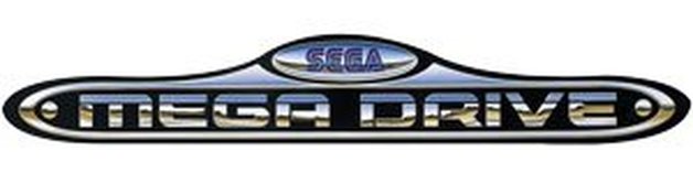
So of its time, you have to at least give Sega credit for creating a logo which reflected the curious design of its host system. The chrome letters are achingly dated, but there remains something appealing about the logo.
SUPER NINTENDO ENTERTAINMENT SYSTEM
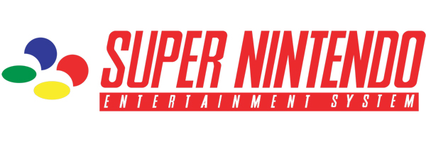
There's little to get excited about from the Super Nintendo logo - despite it being italicised in an apparent bid to make it feel dynamic. It's probably the most overtly Japanese-feeling of all Nintendo's logos - though the primary coloured blobs (representing the SNES pad's buttons) are a nice touch. Even if they do look like Pac-Men gorging on a couple of melons.
GAME BOY
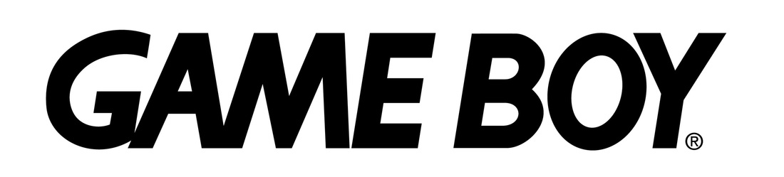
Dull. Distress it slightly and it wouldn't look out of place as the logo for a modern game. And yet, much as it pains us to say, it's instantly recognisable. Curse you, Nintendo, for defying the point we're sort of flailing for here!
NINTENDO 64
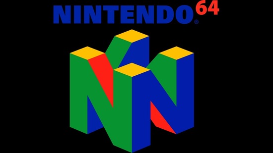
This is more like it. The primary colours remain from the SNES, but the logo is evocative of the system it was slapped on. The 3D "N" directly referenced the fresh epoch of 3D games that the N64 would usher in, while the yellow diamonds at the top of the logo clearly evoke the system's four yellow C buttons.
PLAYSTATION
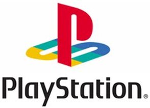
Another decent effort, which paid dividends for Sony when it came to branding the PlayStation. It's cool, but also welcoming, the colours meant to symbolise "joy, passion and excellence". The same designer was also responsible for Sony's VAIO logo. You know what that is? That's a piece of trivia. Sweet.
SEGA SATURN
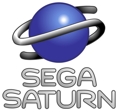
It's an S, but also meant to look like the planet Saturn. Unfortunately, it looks more like a tape worm wrapped around a love egg: a fine metaphor for the Saturn itself.
XBOX
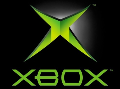
There's something quite brutal and aggressive about the original Xbox logo - the X looking like it's the casing of the console splitting open, or The Hulk's puckering rectum.
Why was it green? Xbox co-creator Seamus Blackley revealed the story to IGN: “A guy called Horace Luke, when we had to have a logo for a meeting or something, he had one of those awesome sets of markers with the paint tips, and so everybody immediately stole all of them. The only color he had left was like the green nobody wanted, and so we made all this artist stuff with green and now it’s like still green."
Why was it green? Xbox co-creator Seamus Blackley revealed the story to IGN: “A guy called Horace Luke, when we had to have a logo for a meeting or something, he had one of those awesome sets of markers with the paint tips, and so everybody immediately stole all of them. The only color he had left was like the green nobody wanted, and so we made all this artist stuff with green and now it’s like still green."
DREAMCAST
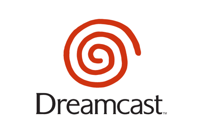
After the tawdry end of the Mega Drive, and the wreck of the Saturn, Sega did everything right with the Dreamcast... short of releasing it three years earlier, before it had ruined everything. The logo - though simple - was a case in point: modest, but iconic and confident. Unfortunately, the hand drawn swirl led certain wags to suggest it looked, appropriately, like a flushing lavatory.
JAGUAR
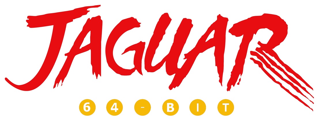
The Jaguar is pretty bold, but also slightly desperate. Clearly it's meant to look as if the letters have been gouged out of somebody's torso, but it just smacks of trying too hard. "Look how edgy we are!" it seemed to crow, followed by: "64-bits, yeah? That's good isn't it? I mean... isn't it?"
3DO
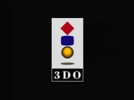
The epitome of corporate thinking, the 3DO logo was as bland as pretty much everything else to do with the system. There are three coloured shapes... which represent the 3D graphics, probably. And those shapes are meant to represent the more serious applications it offered, as well as the chance to watch videos, and play games. Three things, notably, which nobody wanted to do on the 3DO.
PLAYSTATION 2
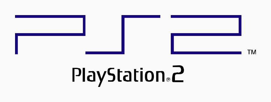
So much for that lovely, colourful, PS logo: Sony went completely minimalist for the PS2. It looked alright when slapped on the black slab of a machine, but hardly stands out in its own right. It looks like part of a Pac-Man maze, or broken circuitry, or something.
GAMECUBE
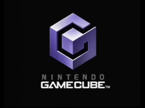
Not quite as fun as the N64 logo, the Gamecube nevertheless continued Nintendo's clever way of telling a story with its branding; it is a G, and also a cube. It's also sort of chrome, which makes it feel a touch dated now.
XBOX 360
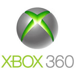
Microsoft stuck with the ruptured X - though wrapped it around a sphere to show that the Xbox was moving into 360-degrees. Whatever that means. The orb sort of looks like a sci-fi baked potato, or a robot brussels sprout. The font is to the point and basic - as we enter into the modern era, where everything is defined by how dull it is.
PLAYSTATION 3
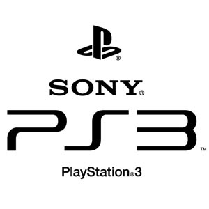
Speaking of... here's Sony's effort for the PS3: a curvier, more organic version of its PS2 logo. The 3 looks like two hardback books stacked on top of one another.
WII
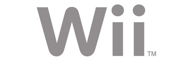
Simple, but achingly clever: the original Wii logo - oh, how we all laughed at the name - manages to not only depict the name of the machine, but the Wiimote controllers, as well as evoke the social aspect of multiplayer gaming, which would propel the machine to considerable success.
WII U
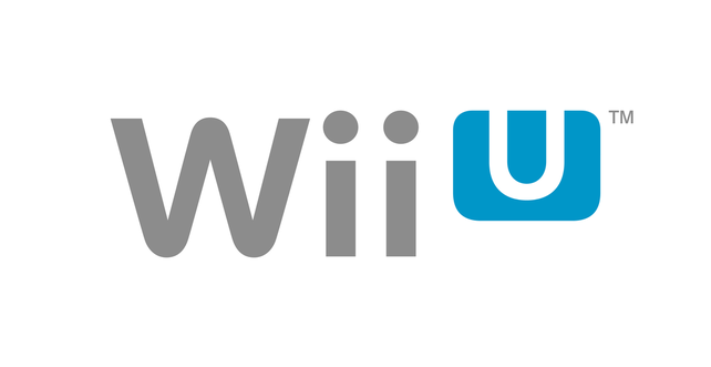
And the Wii U was the same logo, but with somebody placing their tongue on a piece of Blu-Tack.
XBOX ONE
Barely worth mentioning - it's the same logo as its predecessor, more or less.
PLAYSTATION 4
And likewise here.
So are game logos less good than they used to be? They're certainly less interesting, more corporate. At the same time... there's a certain excitement when it comes to anticipating Nintendo's NX logo. How will they tell the story of the machine with its logo? Actually, that's not exciting at all. But... y'know... well. Whatever.
So are game logos less good than they used to be? They're certainly less interesting, more corporate. At the same time... there's a certain excitement when it comes to anticipating Nintendo's NX logo. How will they tell the story of the machine with its logo? Actually, that's not exciting at all. But... y'know... well. Whatever.


 RSS Feed