Think of a game logo. Any logo. Chances are if you can picture one, it probably wasn't created in the last ten years.
Far be it for me to be that old man grumbling about how everything was better in the olden days... but one thing that was undeniably better in the olden days was this thing: game logos.
And here's the proof.
Far be it for me to be that old man grumbling about how everything was better in the olden days... but one thing that was undeniably better in the olden days was this thing: game logos.
And here's the proof.
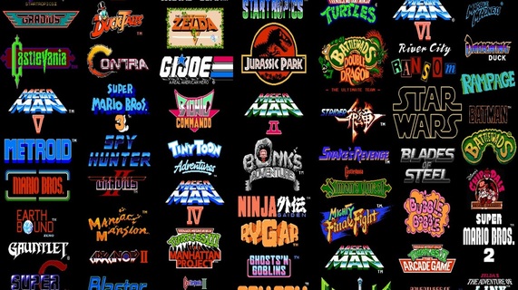
So, are you sufficiently unfortunate to be old enough to remember when game logos looked like this? When they were fun and exciting and reflected the games they represented?
When the logo was as iconic as anything the game itself contained - if not more so?
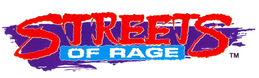
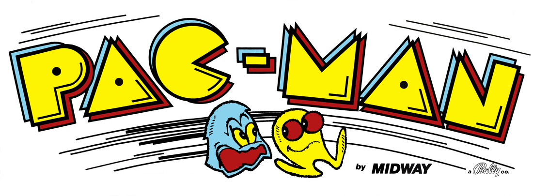
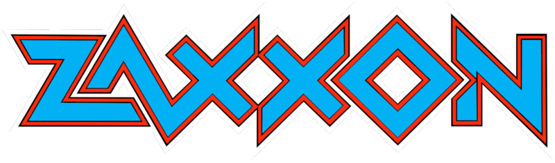
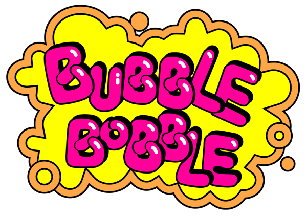
I mean, look at this thing of wonder: it's like street graffiti as done by someone who's just dropped a load of PCP and is holding his spray can in one hand while trying to elbow a tramp in the throat. And that's a real good thing.
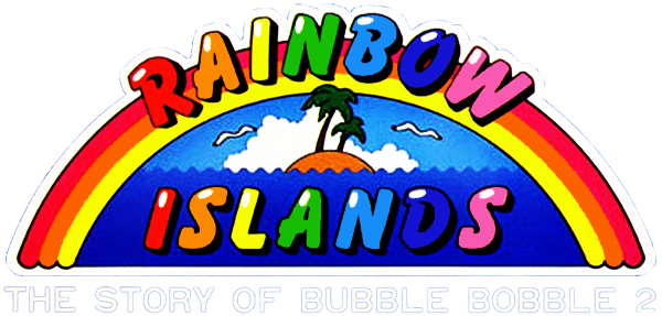
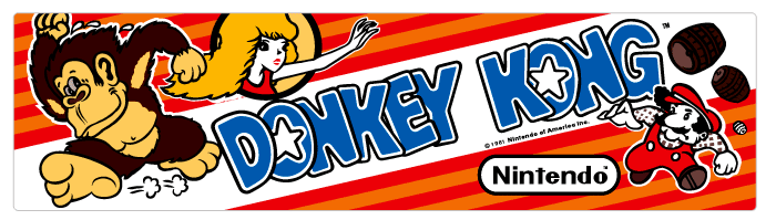
Or there's stuff like this. Bright. Colourful. Optimistic. It's the game in a nutshell - from the three-colour rainbow, to the two tapeworms that have just been "twanged" into the sea.
And now? Now we get garbage like this.
Or this.
"Oooh, Chris - that's great. Just... could you change the logo to Impact, please? And could you make it look a bit distressed at the edges, like it's just come off of a post-apocalyptic printing press? Thanks, Chris. You're the best. Oh - hey; a few of us are going out for drinks after work, if you wanted to come?"
"Yeah, alright. I mean - it's not like this logo is going to take me long."
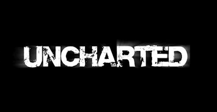
All the modern game logos seem to be feeding off one another. Much as the Tomb Raider reboots are a self-important, humourless rip-off of Uncharted, so the new Tomb Raider logo is a self-important, humourless rip-off of the self-important, humourless, Uncharted logo.
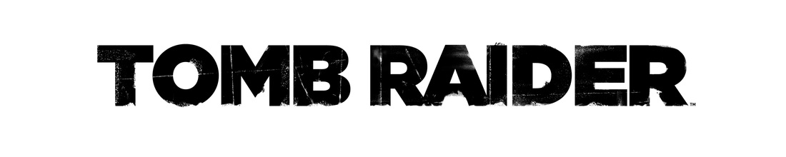
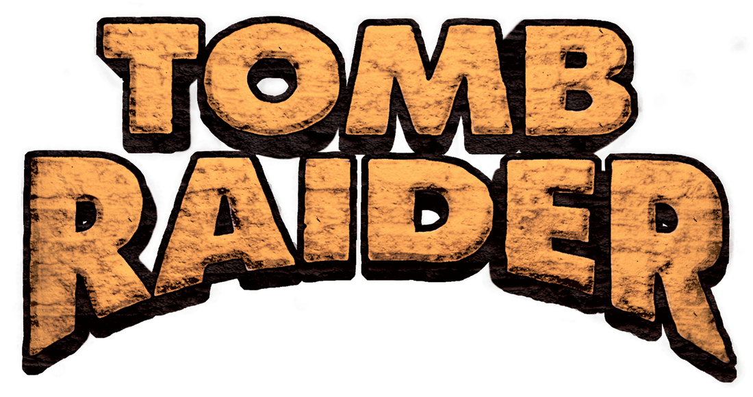
And that's a shame, because the original Tomb Raider logo was great. See? It's like it has been hewn from stone, of the sort you might get in a tomb.
But god forbid the modern logo does anything which might risk over-stimulating a potential customer. You wouldn't want them having a fit in the aisles of Game, shrieking about all the colours and shapes. That would be terrible PR.
But god forbid the modern logo does anything which might risk over-stimulating a potential customer. You wouldn't want them having a fit in the aisles of Game, shrieking about all the colours and shapes. That would be terrible PR.
Don't you yearn for Game logos to look like this? It gave games an identity. It set them apart from everything else. They looked hand drawn, with pencils and rulers and felt-tips, instead of being a half-arsed font that took some disinterested designer about 30 seconds to knock-up.
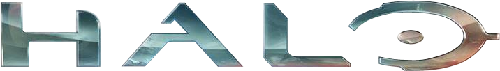
Halo just jumped in there before all game logos became an existing font in one flat colour, but it's still bland. That chrome thing... just... ugh. The stylised "O" does a fair job of portraying the game series' wretched pomposity, though.
How much better would the Halo logo be if it had been drawn like this? Just switch out that Pac-Man and Ghost with a cartoon Master Chief and Covenant.
It's like logos are competing to be as minimalist as possible. For No Man's Sky they just used the font Geo Sans Light, lopped off the middle bit of the A, and erased the tail of the S.
That's not graphic design. That's churning out something as quickly as possible, because you'd rather be out playing Pokemon Go.
That's not graphic design. That's churning out something as quickly as possible, because you'd rather be out playing Pokemon Go.

A squashed Mario in a polkadot sweatshirt. A desperate wench being dragged through a porthole by her hair. This is very much of its time, but even with its dubious qualities it's still better than every other game logo from the past five years.
Oh look. It's a tweaked version of the Impact font again, and somebody has wiped their bum across it lightly. Everyone's a critic, right?
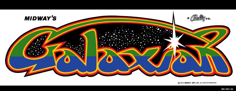
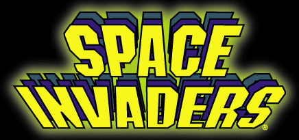
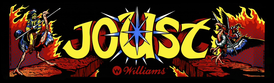
The Space Invaders logo looks simple, but it's so clever. It appears to be bearing down on the player, like the Invaders in the game. And look: there are two more waves behind the font at the front. It actually describes the game.
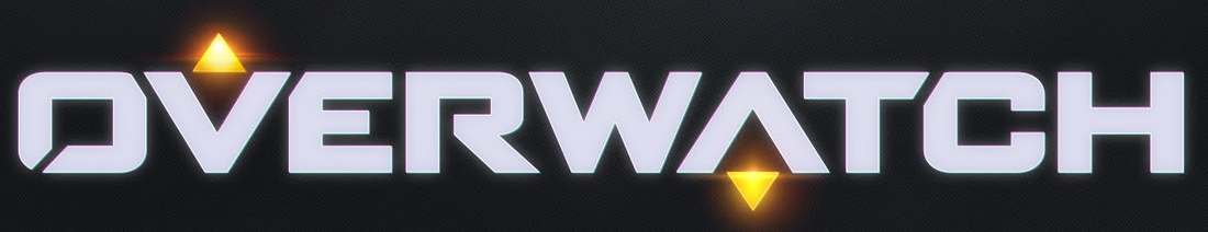
This is the other horrible trend in modern logo designs: reaching for something that feels sort of futuristic. Look out for the triangles/pyramids in modern game logos. They're everywhere.
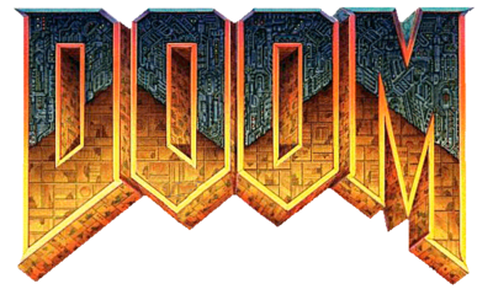
The original Doom logo looks like a pair of fangs, or a portcullis, somehow bringing together the medieval, the futuristic, and the demonic in one. It's a thing of brutal beauty.
Wisely, they brought back the classic logo for the latest Doom. Unwisely, they stripped out all the detail, made it flat colour, and distressed it like the sort of overpriced sideboard that you might find in a West Hampstead furniture shop.
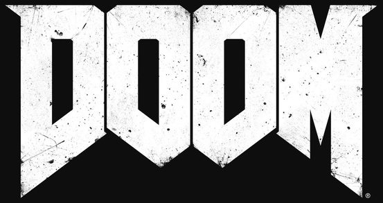
Sigh. I mean... how long did this take? Do you think they even bothered to have a meeting about it? Why even bother trademarking it?
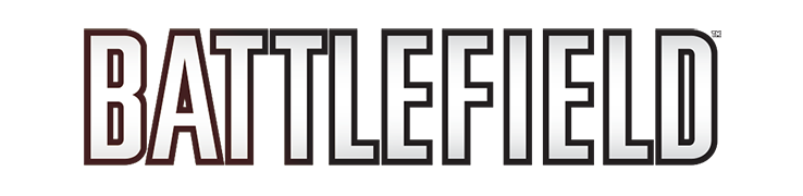
See how wonderful this is? How much better would this look on a t-shirt than the Battlefield logo? And, again, it's clever: those angles hint at the game's isometric perspective.
Another triangle/pyramid there. Conspiracy theorists must be loving it. The only thing stopping the Illuminati adding a single all-seeing eye in the middle is that it would risk breaking up the blandness of the design.
Please can we have logos that look like this? Can we all please stop being so grown-up and sensible? It's like the industry has forgotten that games exist primarily as something you have fun with.
They're so busy trying to tell the world that we're a mature and relevant entertainment industry that they've forgotten it's based on play.
Can you imagine if Fisher Price or Lego suddenly decided to grow-up? Imagine if the box art on their products went all moody and classy. People would think they'd gone mad.
For pity's sake. Just stop doing this!
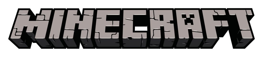
Not all modern games have dull logos, admittedly. Minecraft makes a fair stab at being iconic, and explains the game through typography. There's even a Creeper hidden in there.
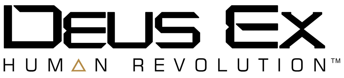
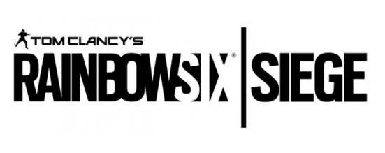
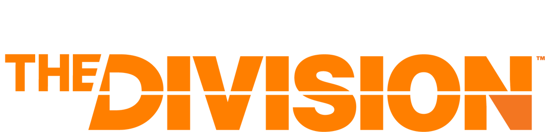
Tom Clancy's "Yet Another Dull Logo" more like.
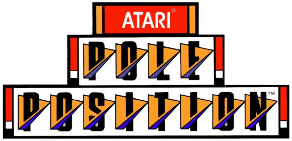
Most racing games back in the day tried to do something interesting, even if it isn't entirely apparent what's meant to be going on here.
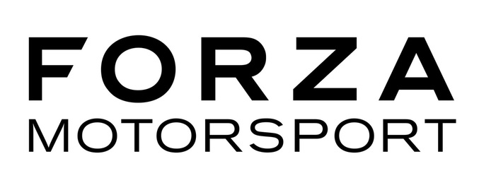
Look at this half-arsed effort.
Is this what you want more of?

Or would you rather have something like this? Make it so.


 RSS Feed