
For many, Roger Dean is best remembered as the artist responsible for countless prog rock album covers - primarily for the bands Yes and Asia. His style is dreamy, surreal, and other-worldly - all stone arches and floating mountains and bizarre wildlife.
You know: like something from the movie Avatar, except not... because a judge inexplicably ruled in favour of zillionaire director James Cameron when Dean took him to court in 2013, over what we must only assume, legally, were merely weird coincidences. You know: it was just by chance that loads of the things in the movie happened to look exactly like things on iconic Roger Dean album covers.
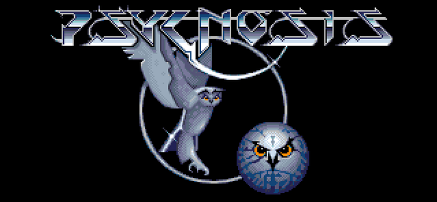
However, to gamers of a certain vintage, Dean is the man who defined the Amiga - specifically through his work with Psygnosis (for whom he also designed the company logo). In an era where far too many game covers were either forgettable or dreadful, Dean's designs and logos stood out. He may not have contributed as much artwork to the games industry as, say, Bob Wakelin, but it's undeniable that the games he worked on felt that little bit more special because of him.
His idiosyncratic approach - he reportedly painted the cover of Yes's Relayer album with "dirty water" - remains immediately recognisable.
Here's a gallery of some of his more notable pieces.
You know: like something from the movie Avatar, except not... because a judge inexplicably ruled in favour of zillionaire director James Cameron when Dean took him to court in 2013, over what we must only assume, legally, were merely weird coincidences. You know: it was just by chance that loads of the things in the movie happened to look exactly like things on iconic Roger Dean album covers.
However, to gamers of a certain vintage, Dean is the man who defined the Amiga - specifically through his work with Psygnosis (for whom he also designed the company logo). In an era where far too many game covers were either forgettable or dreadful, Dean's designs and logos stood out. He may not have contributed as much artwork to the games industry as, say, Bob Wakelin, but it's undeniable that the games he worked on felt that little bit more special because of him.
His idiosyncratic approach - he reportedly painted the cover of Yes's Relayer album with "dirty water" - remains immediately recognisable.
Here's a gallery of some of his more notable pieces.
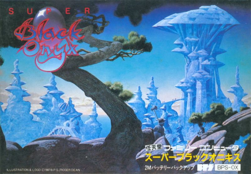
THE BLACK ONYX
Dean's association with computer and video games pre-dated his work for Psygnosis.
His first contribution to a game was for the obscure 1984 role-playing game, The Black Onyx. Though initially released exclusively for the PC-8801 home computer - later getting ports to the NES and Master System - The Black Onyx is considered the first RPG to ever be a hit in Japan, paving the way for Final Fantasy, Dragon Quest, Pokemon and far too many more.
A big part of its success - breaking a genre that had failed previously to find a foothold in Japan (it was created by a Dutchman, Henk Rogers) - was down to Roger Dean's epic cover art.
BARBARIAN
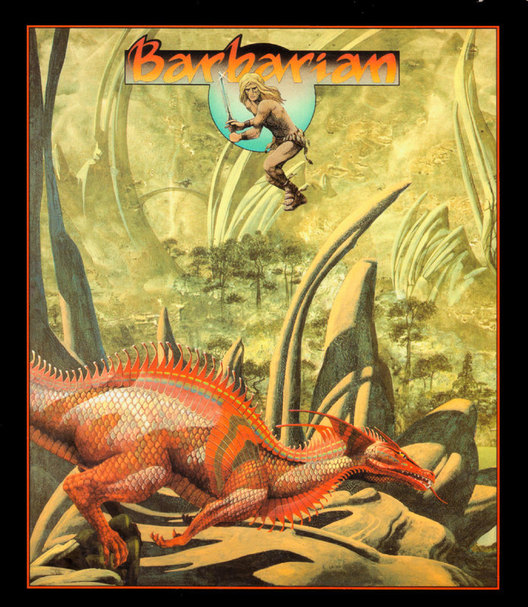
Not to be confused with Barbarian: The Ultimate Warrior, the cover of the Psygnosis fantasy slash 'em up sports some truly beautiful artwork - just look at the way the red dragon pops against that sandy backdrop. Shame about the bloke crouching at the top there like he's "pinching a flapper", but you can't have everything.
By contrast, the The Ultimate Warrior's cover famously opted for a couple of large-breasted semi-nudes, specifically Page 3 girl Maria Whittaker and Wolf from Gladiators. Suffice to say, the bare flesh on show provoked something of a moral outcry, which ensured that Barbarian: The Ultimate Warrior became a much bigger success than Barbarian.
Once again, the public demonstrated that it may not have known much about art, but knew what it liked (mainly: semi-nudes).
TERRORPODS
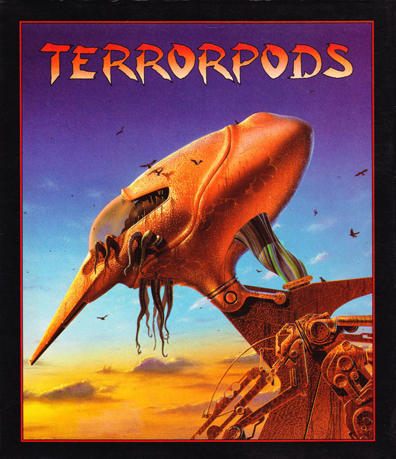
Do you remember Jeff Wayne's War of the Worlds album? I went to see it live in concert a few years ago, and Shane Ward was in it, and it was rubbish and a bit boring.
The main thing I remember about that album was the artwork - the striking depictions of Martian tripods stalking Victorian England. Interestingly, Roger Dean's design for the Terrorpods cover was apparently taken from his unsuccessful pitch for the album sleeve.
Dean's design was reflected in the game itself - albeit rendered in ugly, squat, sprite form - one of many occasions when graphic artists would try and fail to capture the essence of his work.
OBLITERATOR

Not quite as fondly remembered as some of his other Psygnosis covers, Obliterator nevertheless once again demonstrates how Dean would use a primary-coloured central figure against more earthy tones to make it stand out. Unlike some of Dean's other work, the developers chose not to use his designs in the game. And who can blame them - because, frankly, what is that?!
BRATACCAS
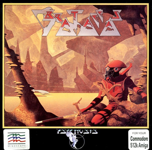
The main character in Brataccas - a game reportedly borne from the remains of the fabled ZX Spectrum "Mega Game" Bandersnatch - more or less recalled the figure on the cover art. It's classic Dean; there's something peaceful and empty about it, evoking long-forgotten civilisations and a spirit of exploration. Also, this boasts one of Dean's best game logos. Providing as you don't mind not being able to read it.
The piece was later re-used for the cover of a 2001 greatest hits album from British proggers Uriah Heep.
The piece was later re-used for the cover of a 2001 greatest hits album from British proggers Uriah Heep.
SHADOW OF THE BEAST
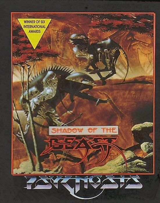
One of the biggest Amiga games of all time, Shadow of the Beast was no doubt helped by a concerted effort to reflect Roger Dean's art in-game. Admittedly, the graphics didn't much resemble the actual cover - with its autumnal tones and abstract, bio-organic, wildlife - but it's fair to say that artwork has become iconic in itself.
Arguably, the game itself isn't as good as its legendary status would suggest - barring the nice visuals and a great soundtrack - but part of the reason it has endured to this day is down to Dean's contribution. And, probably. the free t-shirt that came with it.
Arguably, the game itself isn't as good as its legendary status would suggest - barring the nice visuals and a great soundtrack - but part of the reason it has endured to this day is down to Dean's contribution. And, probably. the free t-shirt that came with it.
SHADOW OF THE BEAST II
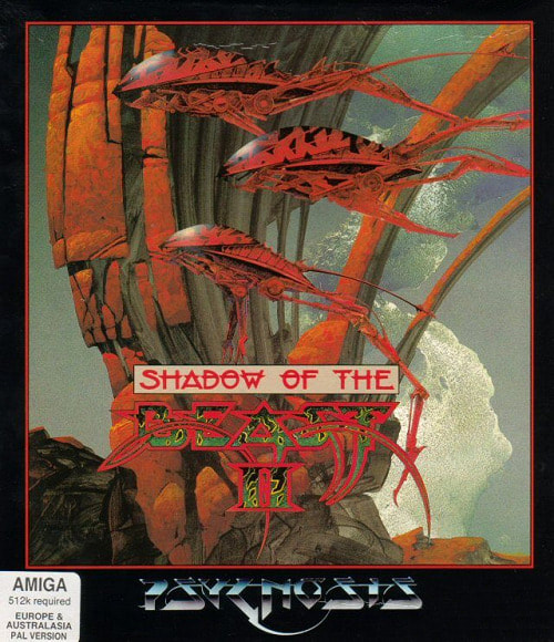
For me, the Shadow of the Beast II cover was the high point of Dean's work with Psygnosis. Once again, it was more an attempt to evoke mystery and mood rather than a literal interpretation of the actual game.
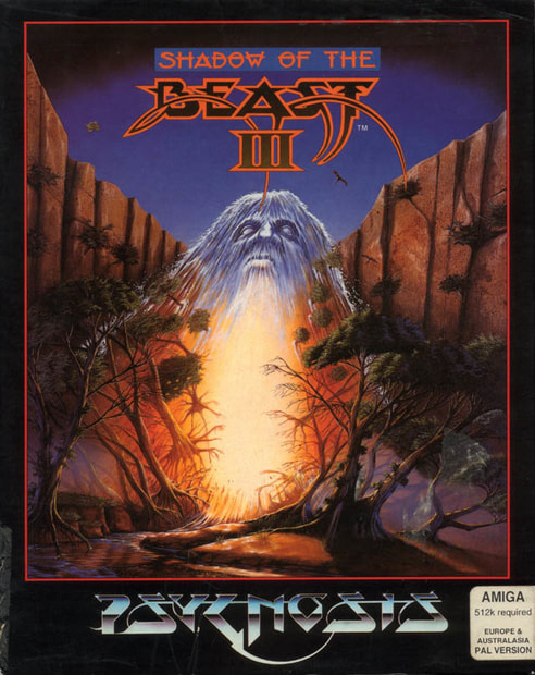
Alas, it was Dean's final cover for the franchise; the third game in the series featured art by David Rowe (who also designed the covers for Populous, Speedball and James Pond 2: Robocod). It was, y'know, fine for what it was, but not quite in the same league... seeming to depict a ghostly Alan Moore with his beard on fire.
Alas, it was Dean's final cover for the franchise; the third game in the series featured art by David Rowe (who also designed the covers for Populous, Speedball and James Pond 2: Robocod). It was, y'know, fine for what it was, but not quite in the same league... seeming to depict a ghostly Alan Moore with his beard on fire.
AGONY
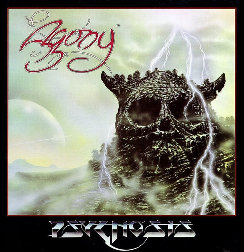
Though he's often credited for the Agony artwork, this isn't a Roger Dean piece - and it shows, frankly - but he did design the logo. Which, admittedly, isn't one of his best, and would be more appropriate for a sitcom about a problem page Agony Aunt.
TETRIS WORLDS

It wasn't just Psygnosis that Dean created artwork for; here's some of his stuff on the cover of Tetris Worlds, for which he also designed the logo. It's not terribly memorable, but it remains classic Dean in its execution. Heck, it even sports a floating mountain, entirely different to the identical ones that James Cameron had in Avatar.
FATAL REWIND

This was originally released on the Amiga and Atari ST as The Killing Gameshow, with a cover showing a fairly generic airbrushed eyeball. Psygnosis later re-released the game on the Mega Drive as Fatal Rewind, where it re-used more of Dean's rejected War of the Worlds art, and ruined it by slapping the logo over the top of it in a big red box.
FACEBALL 2000

Dean occasionally contributed in-game graphics too, as seen - almost - in the background of this shot from Faceball 2000 on the Super NES. To be honest, given the tiny window and low resolution, whatever they paid him would've been better spent on something else... such as saving it up in the event of a lawsuit from the creators of Pac-Man.
Well done, Roger Dean! Well done for all the lovely art, you sweet and clever boy!
Well done, Roger Dean! Well done for all the lovely art, you sweet and clever boy!
SUPPORT DIGITISER2000 ON PATREON FOR LESS THAN £1 A MONTH - AND GET ACCESS TO SOME SWEEEEEEET EXCLUSIVE POSTS!


 RSS Feed