
Usually when I'm asked for my favourite console of all time, I say the Super Nintendo.
It boasts a catalogue of games that is hard to argue against, they still look great after al these years, and Nintendo didn't ruin everything with loads of unecessary add-ons. Indeed, when the company decided that SNES games needed a bit more oomph, they put extra hardware inside the cartridges.
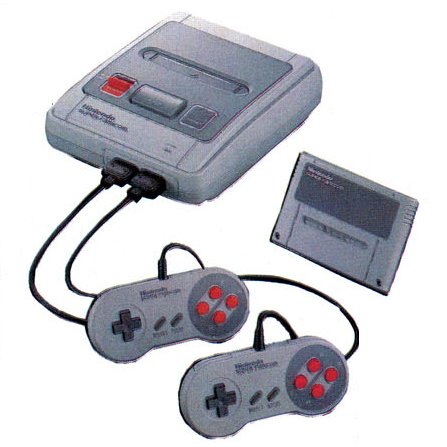
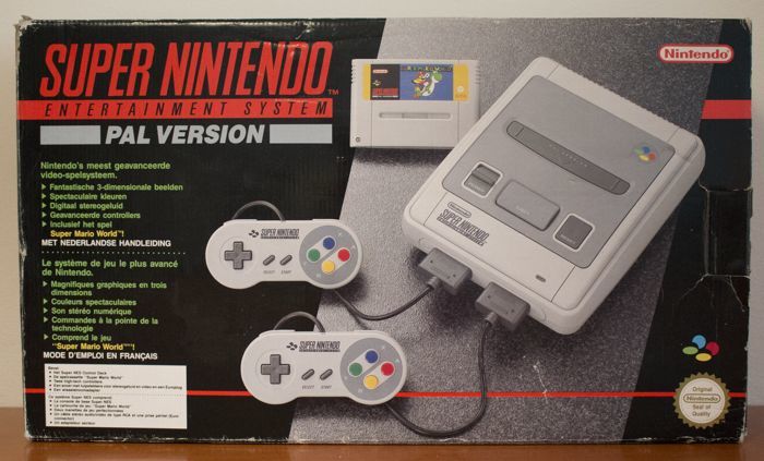
It's not just about the games though. Part of the reason I still love the SNES is because of the SNES itself; it's the most aesthetically-pleasing console ever. It felt nice to hold, to touch, and to look at. You could take the cartridges to bed with you without worrying you'd slice your eyelids open in the night.
Sure, living in the UK meant that the games weren't as fast, and they had black borders, but if we're talking the cosmetic appeal of the host hardware... we won that battle hands-down.
And here's why.
It boasts a catalogue of games that is hard to argue against, they still look great after al these years, and Nintendo didn't ruin everything with loads of unecessary add-ons. Indeed, when the company decided that SNES games needed a bit more oomph, they put extra hardware inside the cartridges.
It's not just about the games though. Part of the reason I still love the SNES is because of the SNES itself; it's the most aesthetically-pleasing console ever. It felt nice to hold, to touch, and to look at. You could take the cartridges to bed with you without worrying you'd slice your eyelids open in the night.
Sure, living in the UK meant that the games weren't as fast, and they had black borders, but if we're talking the cosmetic appeal of the host hardware... we won that battle hands-down.
And here's why.
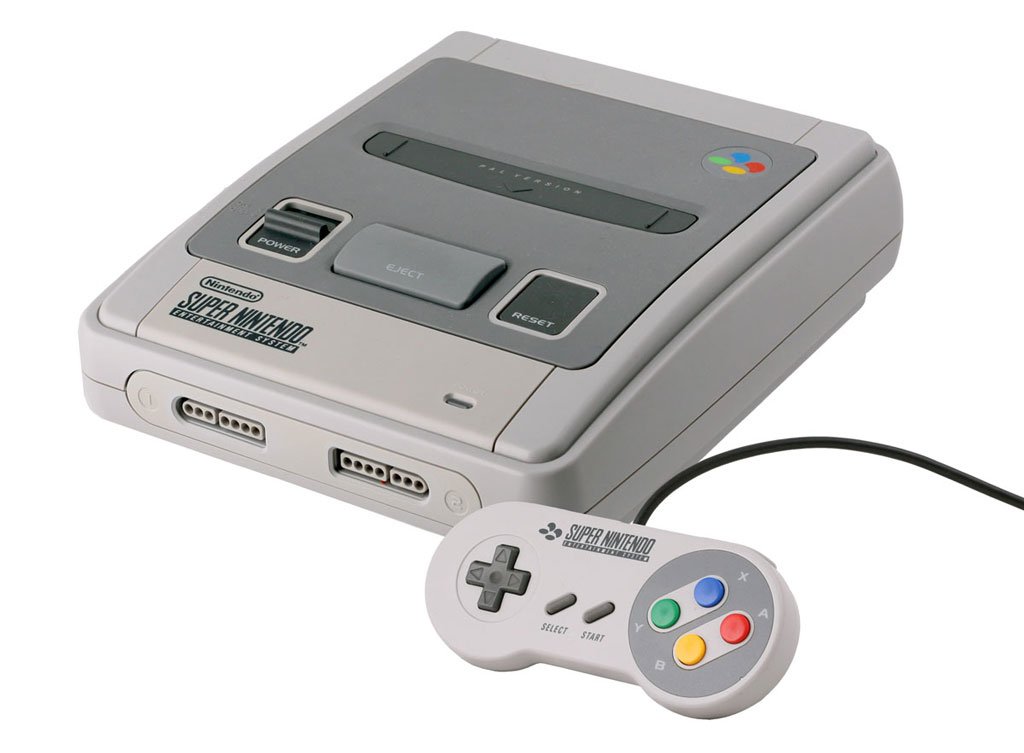
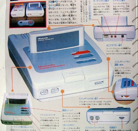
Designer Masayuki Uemura - who created the original, less-than-lovely, Famicom design - was responsible for the look of the Super NES that got released in Japan and PAL territories. From the joypad - nicknamed the "little bone" - to the primary colours of the logo and buttons, to the smooth curves, it remains a design classic.
What's more, it felt solid, expensive... a prestige system, in comparison to Sega's Mega Drive/Genesis, which felt hollow and cheap, and smelled faintly of urine, probably.
For me, though, the thing that my Super NES had going for it the most was that it was friendly and approachable. There was a confidence about it; this thing knew it was to be played with, and it wasn't self-consciously trying to hide among any other consumer electronics you might've owned.
Not everyone agreed with this assessment, however. Least of all Nintendo of America.
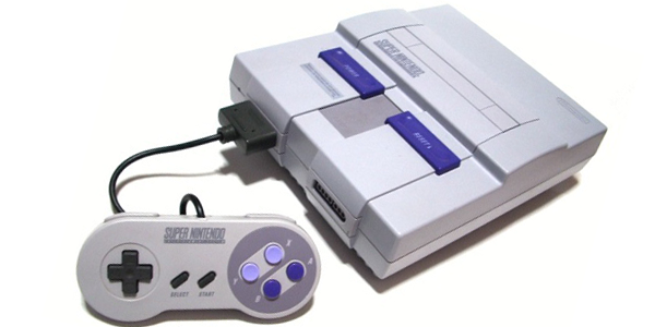
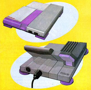
The reason America got a very different-looking SNES is because Nintendo of America wanted a more grown-up-looking console. To wit: a console that ended up looking as if it wasn't entirely comfortable being a console.
One Lance Barr, who'd redesigned the Famicon into the boxy, unappealing, NES - a design meant to evoke a "sleek stereo system", but which ended up looking more like a recycling bin - was given the task of reimagining the hardware for the US market. He had but one design brief: make sure it doesn't look like a toy.
Because, heaven forbid, that a toy looks like a toy.
Barr went for an angular, austere, design, with a rounded cartridge slot - an attempt to prevent users placing drinks atop it (something which, apparently, was an issue with the NES).
In addition, the primary colours were replaced with mauve shades, which made the joypad buttons look like Parma Violets. Yes, the US SNES had the same great catalogue of games, and the same near-perfect joypad, but it had the misfortune of evoking a 16 year-old boyband member trying to discuss the socio-political consequences of Brexit.
Barr - who still works at Nintendo, and had a hand in the Wiimote, among other things - remains unapologetic regarding his monstrous carbuncle. He has defended the unlovely redesign over the years, dismissing the original as looking like "a bag of bread".
To be fair to him, not all of Barr's changes were aesthetic, however. Nintendo intended the SNES to be a modular system, and NoA felt that the rounded Japanese/European design would squat uncomfortably atop any future peripherals.
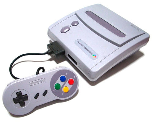
Though never released in Europe, Nintendo did issue a remodel of the SNES - known as the Super Famicom Jr in Japan - in 1997. Oddly, Barr was responsible for the redesign in both territories, and this time chose to keep the rounded, smoother, lines of the original Japanese edition.
The New-Style Super Nintendo, as it was sometimes known in the US, was identical to its Japanese counterpart, barring the colours on the buttons - which retained the Super Nintendo's lilac hues.
Quite why Barr chose to make the redesign closer in spirit to the Japanese original is unknown, though we can speculate that, on some unconscious level, he was aware he'd done a big, bad, mess-up.
However, even the Japanese version of the SNES could've gone in a different, less pleasant, direction...
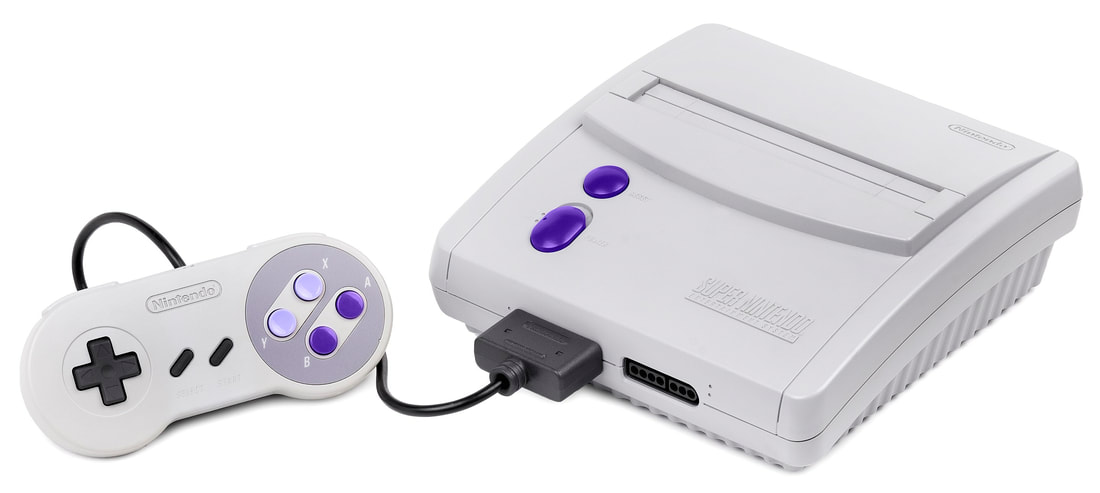
The first leaks of Nintendo of Japan's Super Famicom showed that the curves and two-tone grey top were there early on, but the power, reset, and eject buttons were placed differently to how they ended up. It would've given the hardware a feel that was more somber and less fun than the end result.
Nintendo of Japan seemingly settled on a design for its Super NES relatively early on. The only difference between the first publicly-released images of the final hardware was the colour of the buttons; a Famicom-evoking blood red, before going with those glorious rainbow shades.
Barr took longer to settle upon an approved design for the US release. Some of his early sketches show a wildly different approach to the one American gamers ended up with. They might not have been practical, but they were certainly more interesting than the final design.
Indeed, beyond the purple trimmings, they were practically unrecognisable from the end product.
Indeed, beyond the purple trimmings, they were practically unrecognisable from the end product.
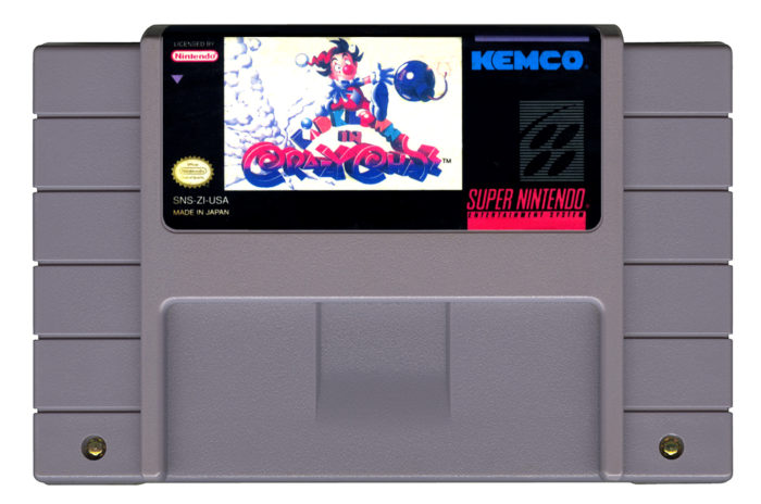
Barr's SNES redesign also extended to the games; US cartridges echoed the look of their host hardware; straight lines/no nonsense/no fun.
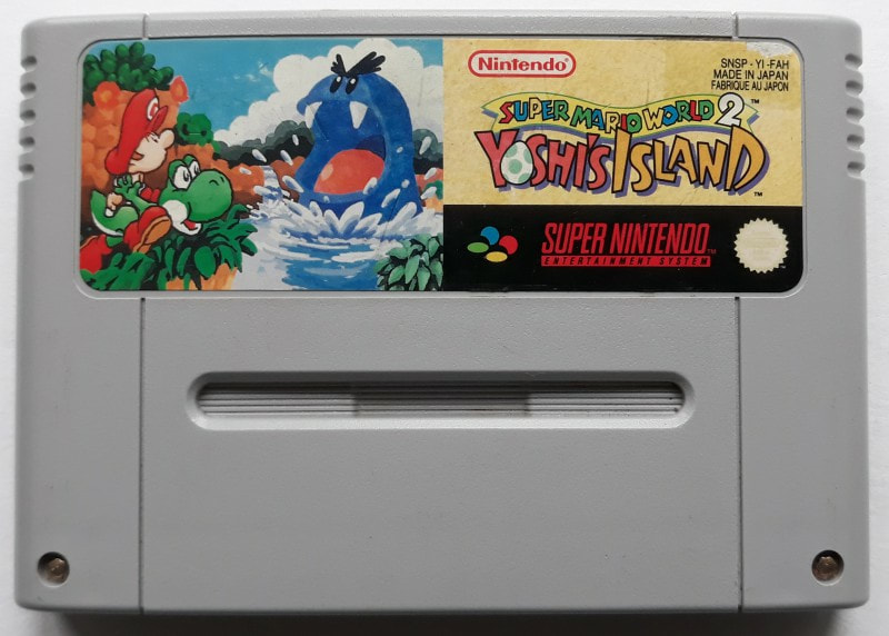
Wheras the Japanese and PAL carts were all lovely and round and friendly and that, and felt nice to hold in your hand.
Back in the early-to-mid 90s, us British SNES owners would frequently read about how we got the raw end of the deal; we were told our SNES games were sluggish and underpowered.
Yes, it's fair to say that Japanese SNES got the best of both worlds, given the choice between a barely-noticeable reduction in speed and a couple of black bars on screen, and a console that looked like the pubescent ideal of "grown-up", we undoubtedly had it at least second best.
Yes, it's fair to say that Japanese SNES got the best of both worlds, given the choice between a barely-noticeable reduction in speed and a couple of black bars on screen, and a console that looked like the pubescent ideal of "grown-up", we undoubtedly had it at least second best.


 RSS Feed