When Sega released its Master System - or, rather, re-released it in The Rest of the World after its 1985 Japanese launch as the Sega Mk 3 - it chose to tie all of its cover artwork together.
Using a distinctive black grid on a white backdrop, it was never going to be particularly aesthetically appealing, but in the Master System's early days Sega decided to double down on this ill-considered choice.
In short: the first batch of Master System games featured some of the worst, laziest, and downright amateurish cover artwork ever seen.
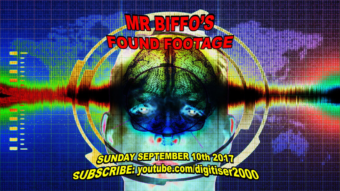
Here are but ten examples of this eye-watering awfulness.
Using a distinctive black grid on a white backdrop, it was never going to be particularly aesthetically appealing, but in the Master System's early days Sega decided to double down on this ill-considered choice.
In short: the first batch of Master System games featured some of the worst, laziest, and downright amateurish cover artwork ever seen.
Here are but ten examples of this eye-watering awfulness.
PRO WRESTLING
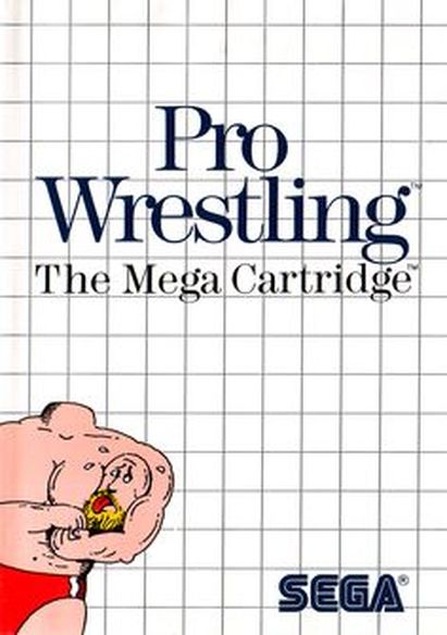
Uh... so, we all get that wrestlers put their opponents in headlocks, yes? So what's going on here? The wrestler has removed his own head, and is putting it in a headlock, and that head appears to be choking. Which doesn't make a Jonty of sense, given that his neck remains on his body.
Also, look at the left hand side; the artist hasn't even bothered to finish drawing the body. They've just given up.
Interestingly - or not - this cover inspired a dream I once had. My local ice cream man, Beagan, had been serving my local community my entire life (he only retired a few years back), and even gave me a free lolly after I dropped 50p down a drain as I was trying to pay.
He was a lovely man, and one night I dreamt that his head fell off due to a strong breeze, and he had to balance it atop his neck by wrapping a thick scarf around it.
SECRET COMMAND
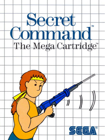
I suppose the best way of remaining is secret would be to remove your own mouth. Clearly this "character" is inspired by Rambo, albeit by reimagining him as a red-headed mouthless with a bushy ponytail. Good work, though, conveying how confused he appears to be, while having one fewer facial feature than is the norm.
BLACK BELT
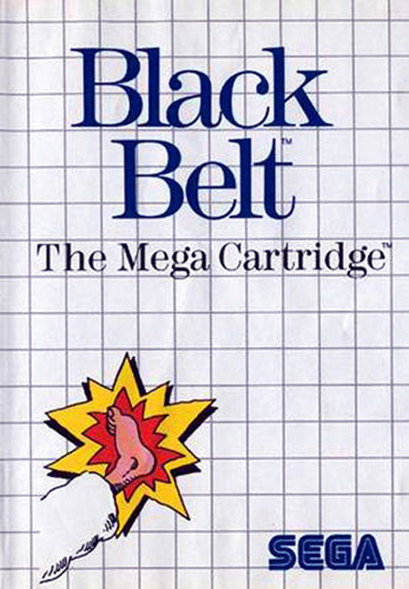
There's not much to say here, other than it's rubbish. Note, however, that the martial artist's leg isn't casting a shadow, whereas the impact is. This implies that, perhaps, he's kicking a piece of paper that has been cut out to resemble an impact. Or maybe it's stuck to his foot.
Or maybe they got the work experience kid to draw it, while slapping him around the back of the head with a folder.
Or maybe they got the work experience kid to draw it, while slapping him around the back of the head with a folder.
ACTION FIGHTER
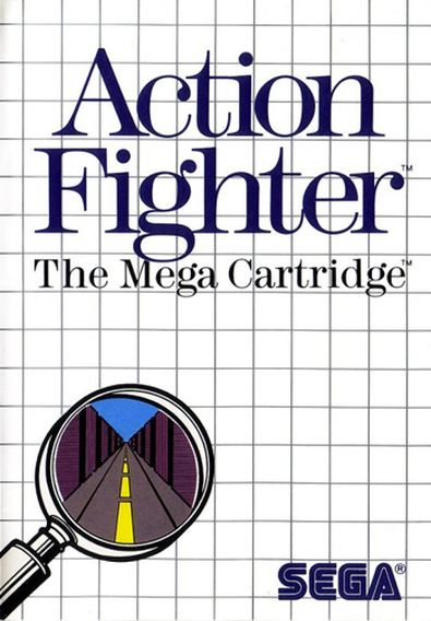
"How best to sum up our exciting new game Action Fighter, John? Maybe a drawing of some action, or some fighting?"
"I've got a much better idea!"
"What's that?"
<JOHN RUNS OUT OF THE ROOM SUDDENLY>
"Great. There goes our only artist."
"I've got a much better idea!"
"What's that?"
<JOHN RUNS OUT OF THE ROOM SUDDENLY>
"Great. There goes our only artist."
ZILLION
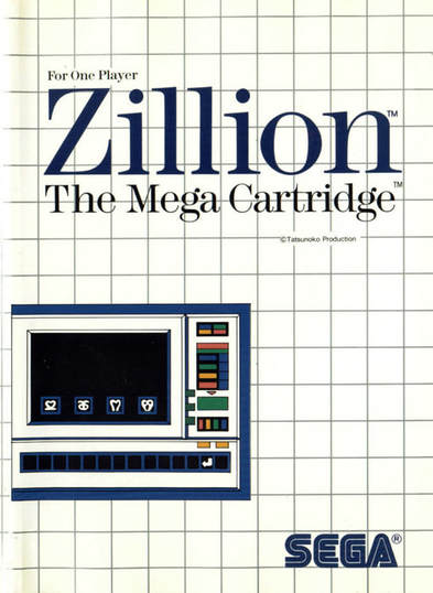
This... this tells you everything you need to know about the video game Zillion. Chief among these things is that you probably don't want to buy a microwave oven simulator.
QUARTET
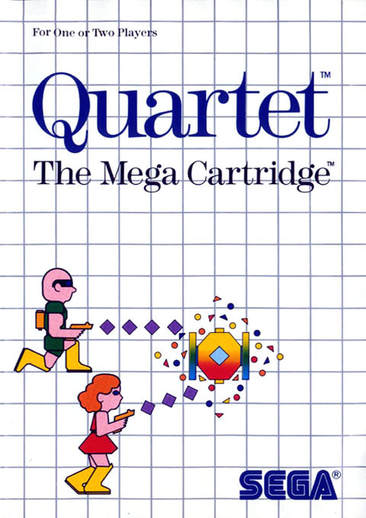
Remember the famous four-player game Quartet? Here it is on the Sega Master System, reduced to a Duet. Furthermore, it boasts artwork that - rather than try to convey an exciting arcade conversion full of sci-fi coolness - depicts a failed attempt to recreate pixel artwork on your tea break, using some felt tip pens.
ALEX KIDD IN MIRACLE WORLD
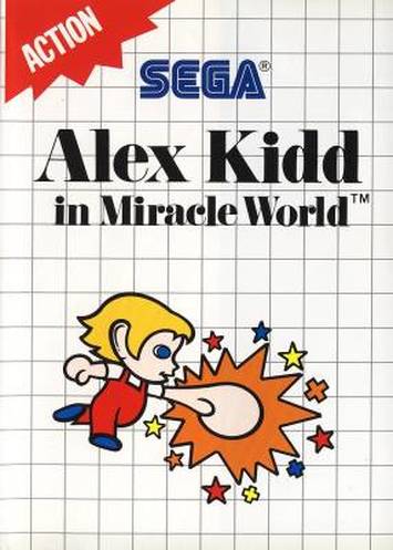
Alex Kidd was Sega's blatant attempt to create its own Mario - see the dungarees? Shameless. Admittedly, there wasn't much to work with; this otherwise dreadful art does succeed in depicting the character relatively accurately. Furthermore, it conveys the character's main power: the ability to transform his fist into an oven-ready chicken...
TRANSBOT
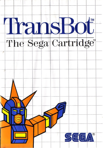
"Yeah, I do know the way to the lemon shop. You go down there, take the first left, then it's on the corner of the second road on the right. By the way, in case you hadn't noticed... I'm orange - the colour of power!"
GREAT BASKETBALL
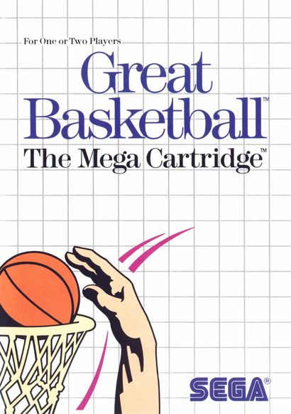
At first this doesn't see too bad. Then you realise that the basketball is far, far too small. And doesn't actually look like a basketball. It's a sort of magic eye-style tableaux of terribleness; the more you look, the worse it is.
KUNG FU KID
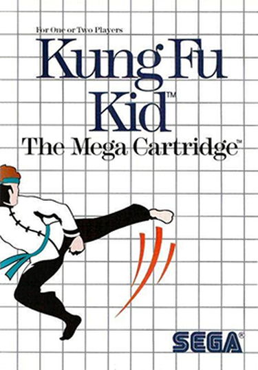
Looking more like Michale Flatley mid-Riverdance than a Kung-Fu Kid, the most baffling things about this character are the fin on his right shin, and why he appears to have a legging and a sock down one appendage, and a boot-cut trouser and bare foot on the other. Perhaps he's a kinky half-fishman.


 RSS Feed