
Do you know what's most weird about Ultimate Play The Game - arguably the most important British games company of the 1980s? There were a mere three years between its first and last games. In that time, the company had essentially defined the ZX Spectrum, cementing itself among the most iconic gaming brands of all time. They were, it's fair to say, The Beatles of Spectrum development.
Though there's no doubt that Ultimate would have achieved little had its games not been great... somehow their magic went beyond the games themselves.
Everything about Ultimate Play The Game was kind of mysterious and seductive. The company's name itself didn't really make a lot of sense in and of itself, but that merely added to the mystique. An Ultimate game felt like a coherent package. The company had an identity.
Even before you got to play an Ultimate game the artwork was selling you on the promise; they had a distinct visual style that was unlike anything else. The chrome airbrushing of the company logo, the box artwork - later, the games came packaged in special custom boxes, which made them feel even more special - which was usually reflected in the loading screens... Potentially, I loved all of that more than I did playing the games.
Here's a selection of their best loading screen work, and how it influenced me.
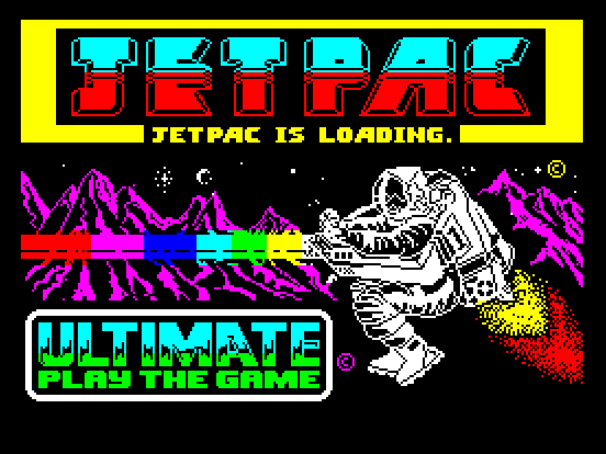
JET PAC
Ultimate's first game wasn't the first I played. In fact, it was the sequel - Lunar Jetman - that I played first, having borrowed a copy off a mate.
I later got most of the previous Ultimate games in one swoop, after another friend gave me a C60 full of evil, pirated software. Yes, I know. I'm a monster. At the same time... my conscience is semi-clear. Any time I could actually afford to buy the games I wanted to play, I bought them. It's like with music; a pirated cassette watered down the magic of unfolding a gatefold sleeve.
I always wanted the full experience - the opening up the cassette box, reading the instructions, studying the inlay artwork. Pirated games just weren't the same. But... as a stopgap, while I saved my pocket money... they did a decent job. Yeah, I know. That's scarcely convincing as a moral justification.
Fact is, Jetpac - and the relatively recent Xbox 360 remake - remains my favourite Ultimate game. It was my gateway drug. Because I played Jetpac, I wanted to play everything Ultimate did. There's an arcade simplicity to it, a lovely sense of weight to your character. This, coupled to basic, but gorgeous, visuals - the stuttering, rainbow, blast of your laser in particular - keeps it focused.
And it all began with that title screen; I hadn't realised until right now that it's rendered in the same seven or eight colours I had to play with when editing teletext pages.
PSSST
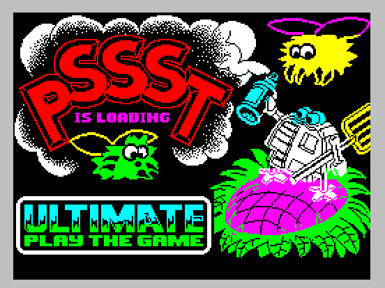
Also on that same C60 bootleg were the other early Ultimate games. Pssst is perhaps the least-loved of Ultimate's canon, despite featuring a tiny robot that looks like a cartoon version of the droids in Silent Running. I don't recall ever playing it for long.
When I became a graphic designer in 1987 - I got a part-time job at Ladbrokes head office, courtesy of my cousin - the Ultimate style was a big influence. Though the Ladbrokes Electronic Service - or "Les" as everyone called it - had more colours and pixels than teletext, I attempted to replicate the boldness of what Ultimate did.
It's easy for me to draw a line between the fluffy "insects" in Psst and the Turner the Worm cartoon I created for Teletext. Not least because my initial attempt at creating a teletext cartoon character was a sort of fluffy insect thing called Rascal.
TRANS AM
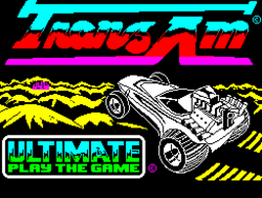
Graphically, the most stripped back of Ultimate's games, Trans Am also has the distinction of being the only one of their early games not to feature a cartoon-y lead character. You controlled a car, in a sort of post-apocalyptic wasteland. It was a direct homage to Mad Max.
I played it a lot at the time - it was simple, easy to control, yet it lacked the specialness of their other games. It didn't feel as unique, or part of the rest of their catalogue.
I played it a lot at the time - it was simple, easy to control, yet it lacked the specialness of their other games. It didn't feel as unique, or part of the rest of their catalogue.
COOKIE
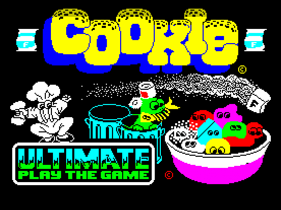
Cookie just felt to me like a remix of Jetpac, but without all the cool sci-fi stuff. It nevertheless displayed the hallmarks of the company; sound effects that would become increasingly familiar, the random path of the floating, abstract enemies - and that, unique, sort of loose control system.
Still, playing it now you can see how the company was establishing itself, defining its style. It was already setting itself apart. See the cartoon eyes on an otherwise faceless character?
Still, playing it now you can see how the company was establishing itself, defining its style. It was already setting itself apart. See the cartoon eyes on an otherwise faceless character?
LUNAR JETMAN
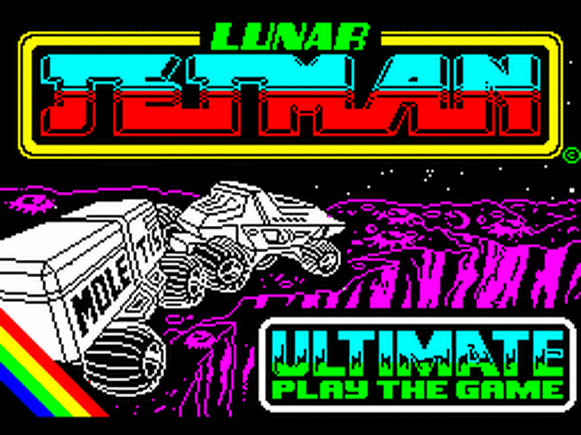
I liked Lunar Jetman, but I didn't love it. It was only after playing Jetpac that I realised why; I mostly just enjoyed the flying around stuff, but the driving elements - as cool as that lunar rover was - were a chore.
The bulk of the game had you driving across a moonscape building bridges across craters. That, to me, was tedium incarnate. I just wanted to play with the laser cannon.
Nevertheless, the design of the technology was cool, albeit apparently heavily influenced by Big Trak - a popular 80s toy tank, with programmable controls. Unfortunately, unlike Big Trak - which had an optional trailer accessory - the "Mole" trailer promised in the title screen somehow never made it into the finished game.
ATIC ATAC
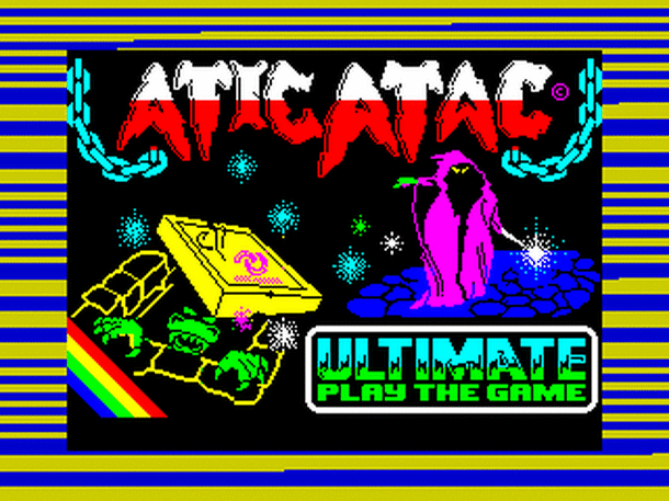
This was the first Ultimate game I heard about - though not the first I played. Friends would talk about it at school. I admit... when I first played it, I was slightly disappointed. Nevertheless, like so many Ultimate games, what I loved was the art design, especially on the loading screen.
I think what their artwork really gave me was how to suggest a lot with just a few colours. Being able to compare the box artwork with the loading screen - created with limited resources - taught me many useful lessons.
Having a black background, and just seven colours, it was a case of deciding which would stand in for other shades. Wood was generally yellow or red. Red typically took the place of brown. Magenta, yellow or white were white skin tones, and red was usually black skin. Cyan was steel or stone.
A mix of blue and black - as in the Atic Atac loading screen - were used to create a sense of depth in a design. Bright colours in the foreground, blue in the middle distance, black beyond.
SABRE WULF (BBC Version)
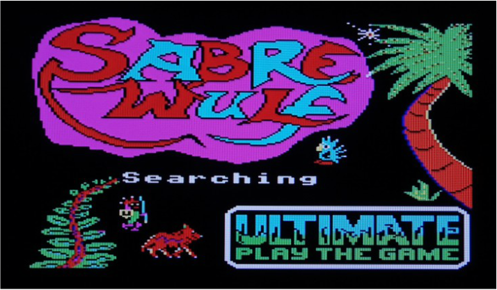
I never got along with Sabre Wulf, though I loved the design of its jungle levels. The screen above is from the Commodore 64 version.
Somehow, learning that Ultimate games were becoming available increasingly on other formats made me feel a bit funny. It was like learning that your dad occasionally went to have tea with another family.
When I saw Sabre Wulf running on a C64 I was disappointed; the colours were muted, like on most C64 games. It was as if, in the process of betraying its Spectrum roots, the game had lost its vibrancy out of sheer guilt.
Commodore 64 owners might not have had colour clash, but they were missing out on the neon thrill of Ultimate at their best.
UNDERWURLDE
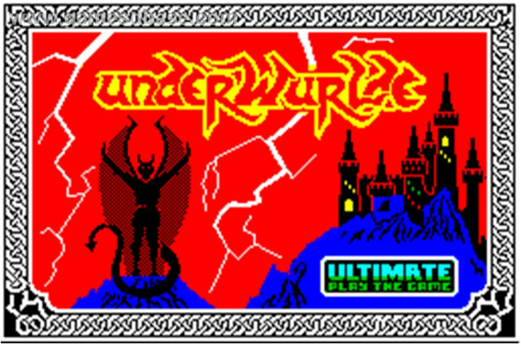
This was the Ultimate game I played the most. My mum bought it to give to me for Christmas 1984, having chosen it on a shopping trip to the Brent Cross centre - the same day I bought the Band Aid single. I couldn't wait to play it, though. Literally.
I knew where she kept the Christmas presents, and spent the next few weeks sneaking into her wardrobe and loading up the game. I never finished it - never came close to finishing it. But I played the first dozen or so caverns so many times that I started to see them burned onto the insides of my eyelids. By the time Christmas Day came around I was already a bit bored of it.
What makes me jealous about the above image are the demon's wings; if only we could've achieved an effect like that on teletext. Mixing pixels in such a way (in the above case it's black and red), in a chessboard pattern, was how I achieved an increased colour palette at Ladbrokes.
We had the same seven basic colours, but you could mix - say - red and white pixels next to each other, creating a sort of pink hue from a distance. That would, however, only really work with solid 2x3 blocks (Ladbrokes' system, like teletext, broke each page down into 2x3 character rectangles, which could be individually edited to build up a picture). You couldn't then have black in there to create definition on a background of a different colour. But as a cheat, it sort of worked.
KNIGHT LORE
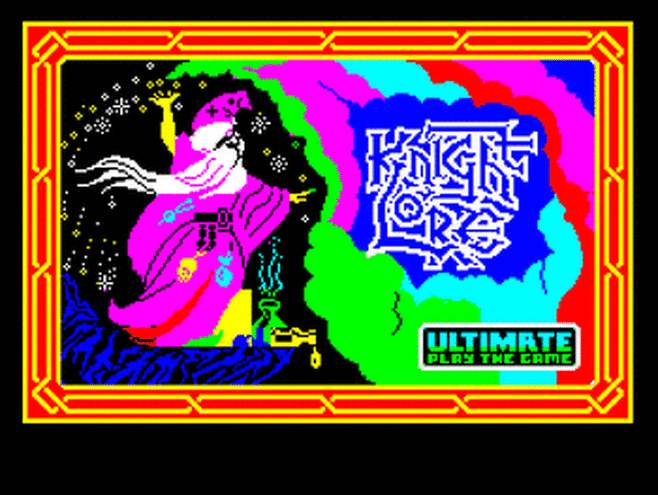
It goes without saying that Knight Lore changed everything. It's one of the most influential games of all time.
Curiously, it's also one of the few Ultimate games whose loading screen doesn't really reflect the box artwork. Instead of mysterious demon-head stone carvings, you get this neon wizard seemingly enjoying Holi Day by flinging a load of marbles into the air.
Knight Lore, at the time, blew the minds of everyone who saw it. What is less talked about is how monstrously difficult it was. I bought it, played it, loved the graphics. Didn't really get along with the uncompromising gameplay.
ALIEN 8
I got Alien 8, hoping for a game that moved things forward as much as Knight Lore did. Instead, we basically got a sci-fi Knight Lore. Though the aesthetics were just about a step up from its predecessor, everything else felt painfully familiar. Just a couple of years after falling in love with Ultimate, I was starting to get bored.
Still... nice packaging once again. I can still recall the texture of those jet-black Ultimate boxes.
Still... nice packaging once again. I can still recall the texture of those jet-black Ultimate boxes.
THE STAFF OF KARNATH
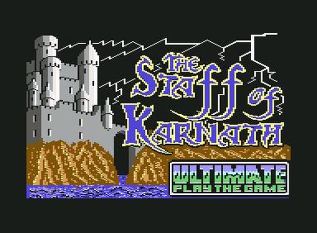
This was the point at which Ultimate broke my heart.
The idea of brand new Ultimate games on the supposedly more powerful Commodore 64 was intriguing... but screenshots in magazines looked underwhelming.
I finally played one of them - I think it was either The Staff of Karnath or Entombed - round at my friend Steve's house (you might know him as Horsenburger), and was proved right. The bold, chunky, cartoon visuals - the signature Ultimate style - was almost entirely absent. Why eat out of a public lavatory when you can have steak at home, right?
What's more, there was an undeniable sense of feeling betrayed. Ultimate, to many of us, was all about the ZX Spectrum. The fact they were making games for rival systems - which wouldn't be available on our own - was beyond the pale...
It's oddly appropriate that I ended up working as a graphic designer for companies which had no time for colours such as brown and grey. When I played with Level 2 teletext graphics - intended as a successor to the familiar seven-colour teletext technology - it felt wrong. I drew a full Turner the Worm strip full of golds, and browns, and a more realistic wormy-pink for Turner. Yet something was lacking. It was no longer the authentic experience.
NIGHTSHADE
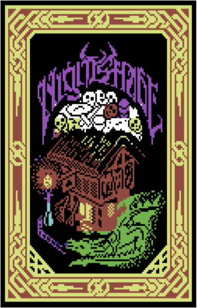
Nightshade was when I pretty much checked out of what Ultimate were doing. Though the game featured an upgraded version of its Filmation engine, to allow for scrolling isometric visuals, somehow it felt like the genre was stagnating.
Everything felt too familiar - the font on the menu screen, the walking sound effect, and plip-plop of your enemies. Plus the gameplay was more just wandering around while avoiding floating, abstract, shapes. The world felt empty next to Knight Lore and Alien 8.
Its successor, Gunfright, was somewhat improved - adding a very simple first-person shooting element - but it was much of a muchness. Ultimate appeared to be running out of inspiration.
From there the games continued their decline - to the bewilderment of the company's fans. What most of us didn't know is that the Stampers had sold the Ultimate brand to US Gold. The team which had made those initial games had evolved into Rare. Which is another story altogether.
The final game to come out on the Ultimate Play The Game label was Bubbler - released in 1987. As far as final statements go, if Ultimate were The Beatles of gaming, the equivalent would be if John, Paul, George and Ringo had been replaced with a bunch of session musicians, and released a disappointing soundalike album called Corporal Salt's Jilted Lover Society. Sad!


 RSS Feed