Please, uncle... what is a logo? It is this: a graphic mark, emblem or symbol designed to be easily identifiable to the public. Take Coca-Cola for example; it doesn't matter what language it's written in, if it uses the company's typeface... it's instantly identifiable.
Also: look at the Atari logo. There's a good reason it hasn't changed in 30-odd years; you don't need any letters to know which company it belongs to, even if its original concept - intended to recall two people high-fiving a packet of cigarillos - has been forgotten.
But... are games company logos better now... or when they began? Here are ten veteran games companies who have changed their logos over the years, for better... or worse?!?
ELECTRONIC ARTS
 |  |
Electronic Arts was formed in 1982, by former Apple employee Trip "Dirty Drips" Hawkins. Daddy Trip's original philosophy was to treat software as an art form - hence the name (chosen after others, including Blue Light and Amazin' Software, were rejected).
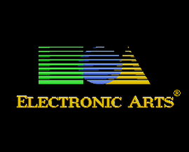
EA's original games were shipped in album cover-style packaging, designed to convey the games as the work of "rock stars". The original logo - which lasted until 2000, in one form or another - depicted a modernist square, circle and triangle, before being replaced by the stylish, corporate, less interesting, vaguely totalitarian, EA-in-a-circle we know now. This was adopted company-wide after originally appearing on the packaging of EA Sports' games.
To date, Electronic Arts has ignored my repeated suggestion that it adopt the slogan "EA've yourself".
SEGA
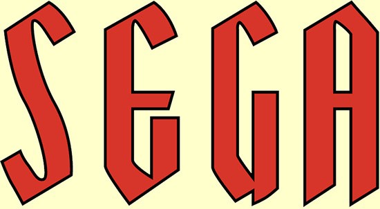 | 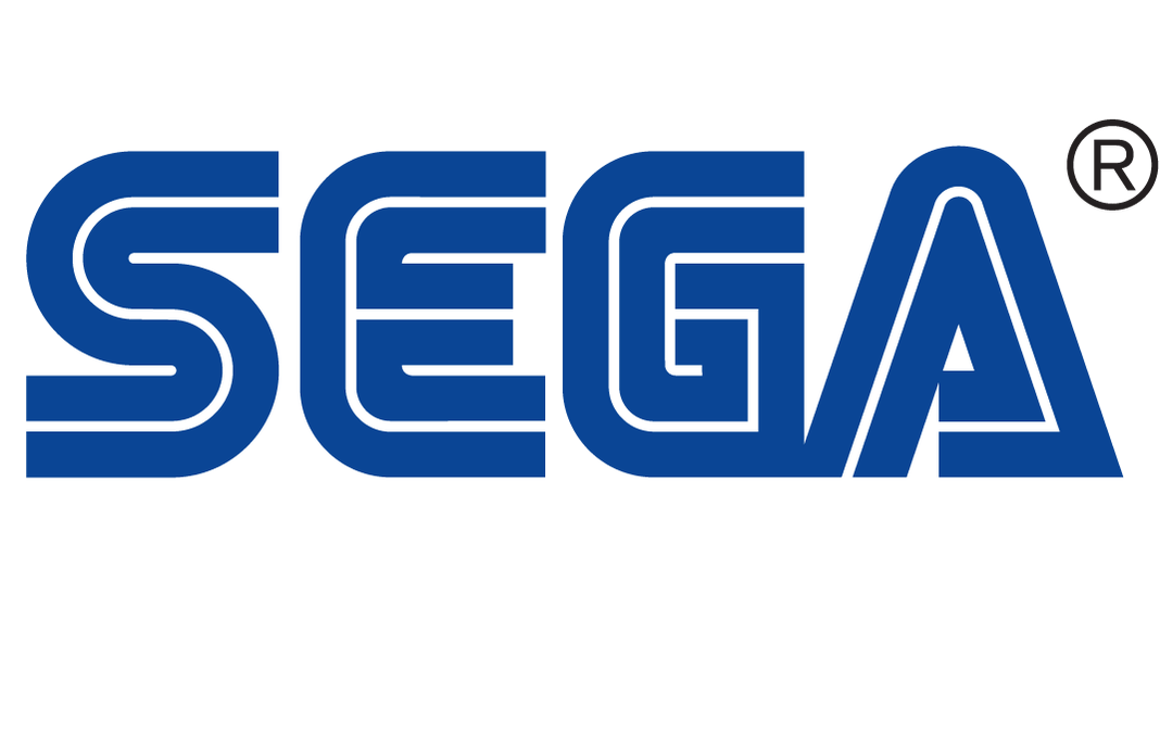 |
Sega has been knocking around since the 1940s, when it began life distributing fruit machines (that is, one-armed bandits, rather than machines which dispensed fruit). The current, iconic, almost perfect, logo was born in 1975. Prior to that, Sega had a thing that looked like... well... like the sort of logo a fruit machine manufacturer from the 1940s might have had.
ACTIVISION
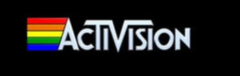 | 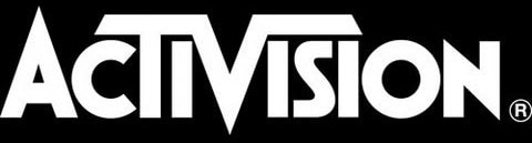 |
The world's first third-party games publisher, Activision - still with its prominent T and V - has barely changed in the intervening years. The only change in all that time came in 1984, when the company ditched the LGBT-friendly rainbow. Come on, Activision; get with the times!
UBISOFT
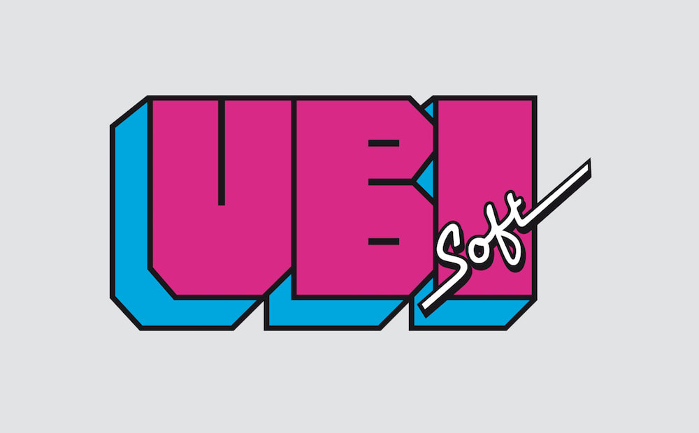 | 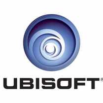 |
Ubisoft has had numerous logo designs since its formation in 1986. Its original logo was a chunky, none-more-80s, hand-drawn design, with a jaunty neon "Soft". The current logo - introduced in 2003 - is a slick, airbrushed, swirl, which is somewhat reminiscent of a flushing lavatory.
RARE
 | 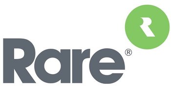 |
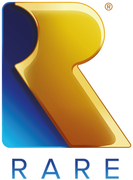
Rare was born out of the ashes of Ultimate Play The Game in 1987, and had a couple of different logos before settling on the iconic Rareware design in 1994 - the point at which it slipped fully into Nintendo's pocket, like a secret pellet.
A shiny, golden, CGI-drenched thing, which reflected (ha ha ha) the pre-rendered visuals present in many of the games it produced during that era, it was a far cry from the company's early Microsofrt-era, minimalist, scarcely-designed logo.
It at least kept the stylised R, albeit inexibicably in a green, offset, bubble, that's seems to ask: "Will that do you?".
Fortunately, Rare returned recently to something more sensible.
NINTENDO
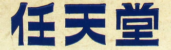 |  |
Nintendo has been in existence since 1889, beginning life as a nude playing card company. Obviously, there was no need for Nintendo to have a logo in English, as it was only catering to its home market in Japan. The original logo offered three Japanese sounds which made up the word "Nintendo".
The company had another 10 logos - including a swoosh-y, brushscript-style one - before, in 1968, settling on a version of the design we're now familiar with. Albeit in an extruded diamond, rather than the sausage-shaped alternative. Nintendo has, of course, kept that design since 1970; fun, bold, classical, sausage.
The company had another 10 logos - including a swoosh-y, brushscript-style one - before, in 1968, settling on a version of the design we're now familiar with. Albeit in an extruded diamond, rather than the sausage-shaped alternative. Nintendo has, of course, kept that design since 1970; fun, bold, classical, sausage.
THQ
 |  |
Founded in 1989 - the THQ stands for Toy Headquarters - THQ was once synonymous with really bad games, but has somehow managed to outlive many of its competitors. The company logo has retained its colour scheme over the years, but in 2001 introduced the dynamic italic version above. A vast improvement on its 80s-style predecessor, but hardly the sort of design that'd make your trousers fall down.
Since being acquired by Nordic Games in 2014, it has done this:
Since being acquired by Nordic Games in 2014, it has done this:

TEAM 17
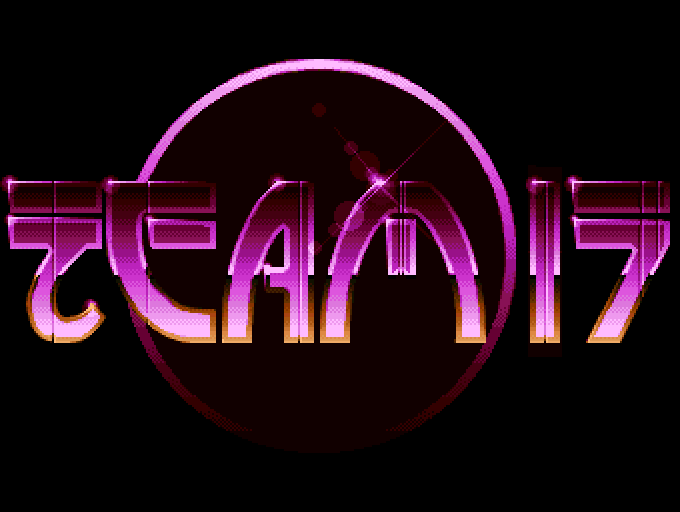 | 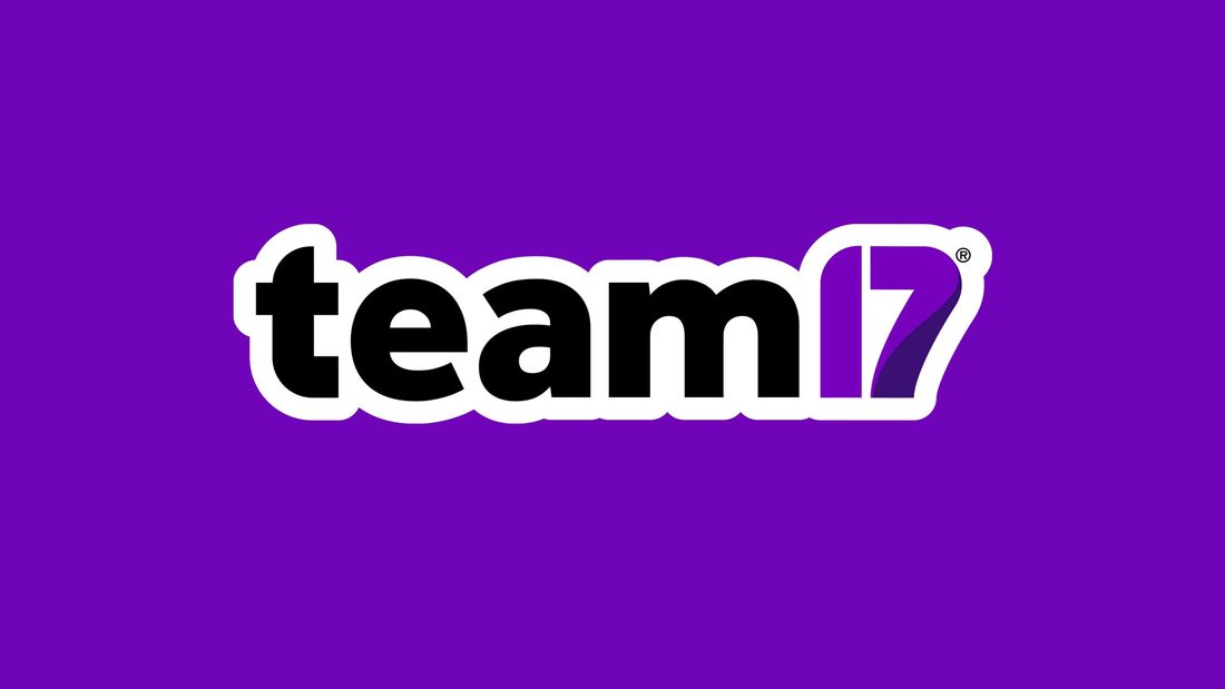 |
Team 17 came about in 1990 via a merger between Team 7 and 17-Bit Software. The company's original logo was a glorious, airbrushed, lens-flare-sporting, purple beaut'. This was used - in various forms - until this year, when Team 17 decided to ditch everything that made its logo interesting, barring the purple. Now it resembles nothing less than a disappointing tattoo atop a bruised arm.
KONAMI
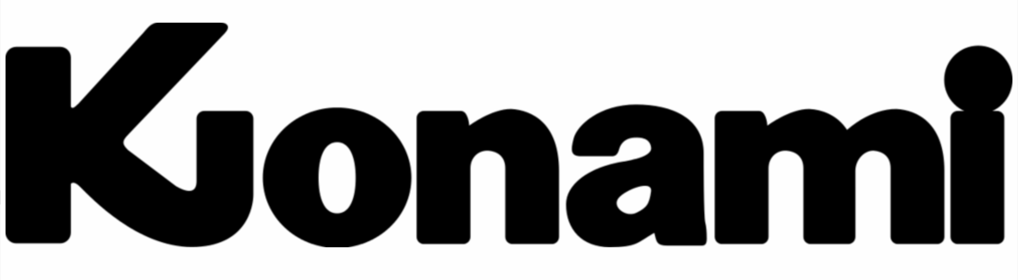 | 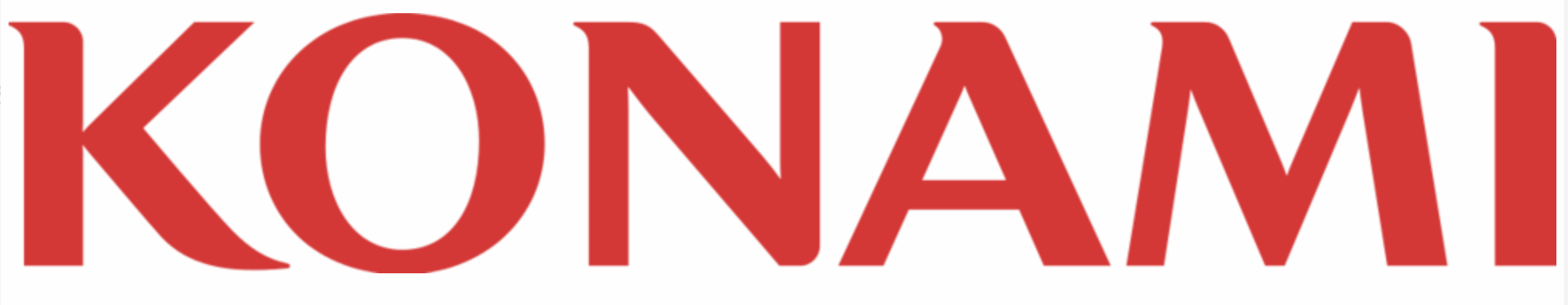 |
Formed in 1968 as a jukebox rental and repair service, Konami first began releasing arcade games in 1978. The company's first logo was fairly nondescript, with a stylised K that - regrettably - made it look as if the company was called "Kionami". The current logo is a return to that fairly nondescript style, but for most of us the classic Konami logo is the one used between 1986 and 2003 - with the two strips of bacon.

SQUARE ENIX
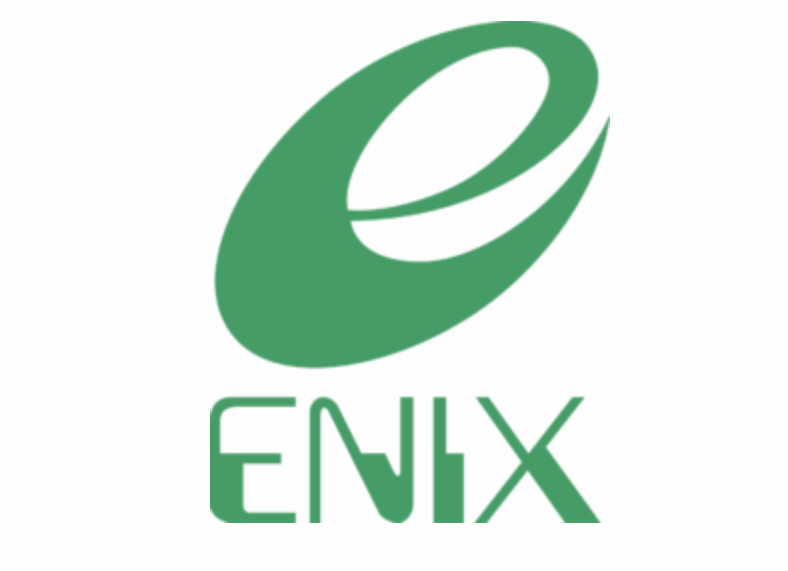 | 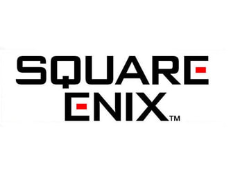 |
Founded in 1975, Enix - a contraction of Phoenix, and intended to evoke ENIAC, the world's first digital computer, or something - the company's original logo used a swooping E above a classic-70s sci-fi font. Following its merger with Square in 2003, it adopted a more angular - or more "square" - version of Square's logo, which remains to this day. Certainly, that original logo has dated, but it's far more interesting than the corporate blandness we now have.
"Oh, aren't we clever? We've made the middle bits of the E's red..."
"Oh, aren't we clever? We've made the middle bits of the E's red..."


 RSS Feed