There's little argument among ZX Spectrum owners that Ultimate Play The Game was the premiere games publisher for the system. If you did want to argue, then that's fine: I accept that you're an idiot.
But get a load of this: it wasn't merely the games which got our loins a-glistenin', but everything from the logo, to the marketing, the none-more-secretive nature of the company's founders - the Stamper Boyz - to the packaging.
When Ultimate started out, the games came trussed into a standard cassette tape box with an inlay card, just like all the rest. With the release of Sabre Wulf in 1984, this all changed. Ultimate doubled the price of its games, and started shipping them in big, black, boxes, with a nice scratchy-textured surface, a glossy booklet, and artwork that was more impressionistic than literal.
It was a canny move, which ensured that the majority of us overlooked the price hike, and bought into the notion that we were purchasing something special and mysterious.
Of course, the benefit of hindsight suggests that we were all suckers who didn't know any better, but when you compare the way Ultimate did its business (so to speak) with most of its contemporaries, they were leagues ahead.
And so... here is a tribute to Ultimate's big box packaging.
All together now.... Iiiiiiii like big box and I cannot lie.
SABRE WULF
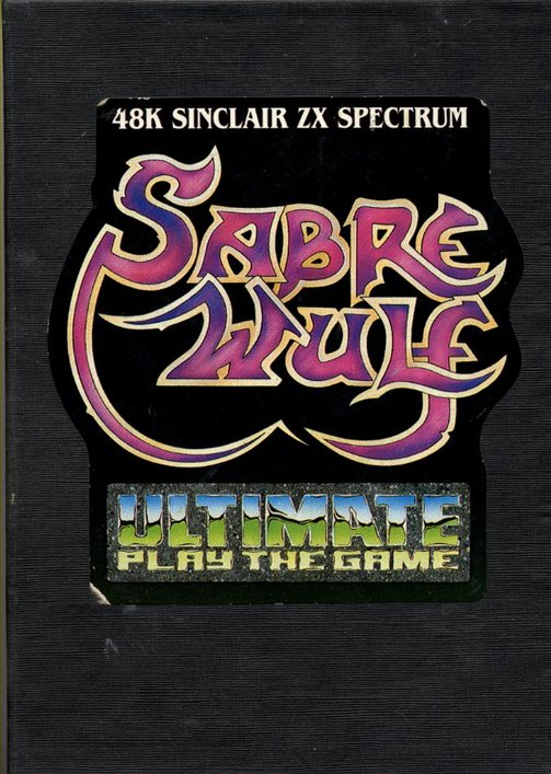
The Ultimate big, black, box debuted with the release of Sabre Wulf, the first game in the loosely-linked Sabreman trilogy (which would've been a quadrilogy had they ever released the planned Mire Mare). Prior to this, Ultimate's games featured solid - but hardly remarkable - airbrushed artwork which displayed a relatively functional representation of the in-game action.
The initial release of Sabre Wulf featured no artwork beyond the game's title and the iconic Ultimate Play The Game logo, and - contrary to convention - no in-game screenshots. Its £9.95 premium price and packaging was created to combat piracy, and it worked; if you didn't own Sabre Wulf, big black box and all, you weren't getting the complete experience.
Piracy might leave you with a few extra quid in your pocket, but what are you going to spend it on?
More drugs, probably.
UNDERWURLDE
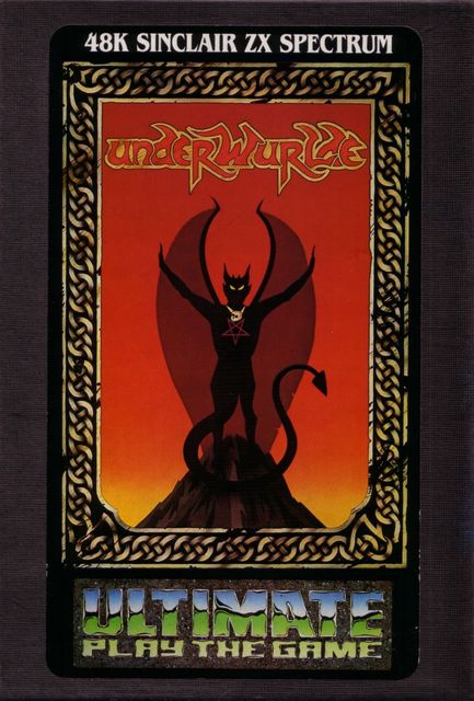
With the release of Underwurlde, Sabre Wulf's sequel, Ultimate introduced another convention to its packaging: the border. This illustrated frame would become standard on its big box artwork which - as seen here - continues to evoke a sense of mystery. Who is that winged fellow on the cover? Why, it's Bongo Whispers - aka The Devil!
KNIGHT LORE
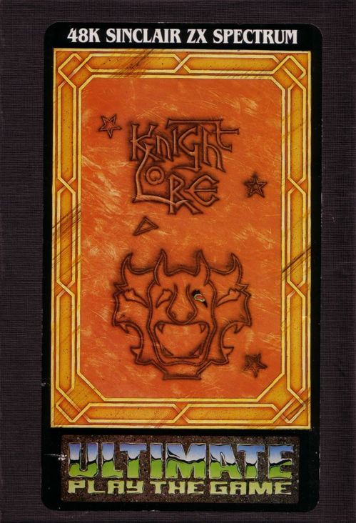
Though completed around the same time as Sabre Wulf and Underwurlde, Knight Lore was held back a year, to ensure sales of the previous two games. Ultimate - quite rightly - concluded that if they released it too soon, Knight Lore's ground-shattering isometric Filmation visuals would've made Sabre Wulf and Underwurlde stink like a tramp's prepuce.
Despite this, Ultimate continued its practice of keeping screenshots from its packaging. Going in, nobody would've known that they were about to be treated to a true next gen experience. For all they knew, it could've been a brass-rubbing simulator.
Despite this, Ultimate continued its practice of keeping screenshots from its packaging. Going in, nobody would've known that they were about to be treated to a true next gen experience. For all they knew, it could've been a brass-rubbing simulator.
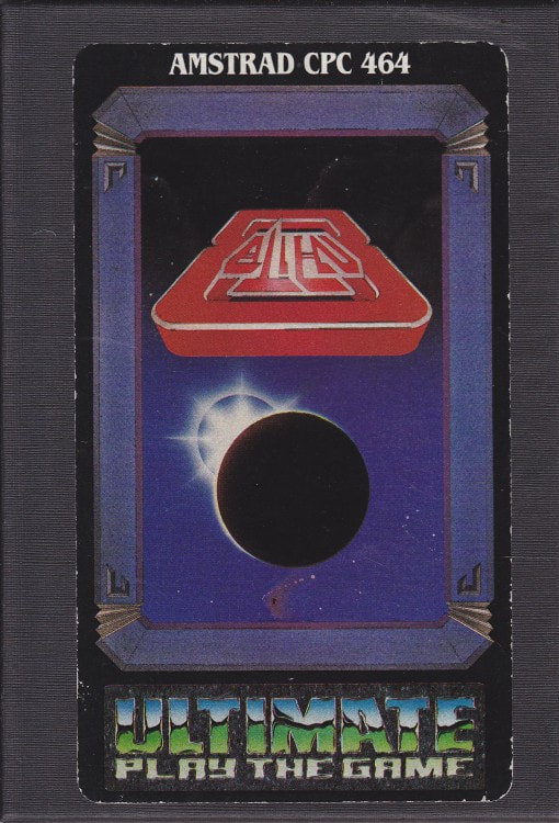
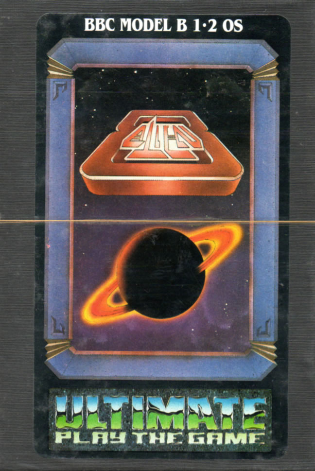
ALIEN 8
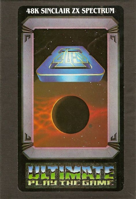
Far and away my favourite Ultimate cover art, Alien 8 is deceptively simple. Quite possibly influenced by the original poster art for the movie Alien - with its mysterious "space egg" - it said plenty without showing more than a shadowy planet buffeted by the sanguine cosmic arse-wind of The Creator.
Interestingly, the artwork was tweaked for the Amstrad and BBC Micro releases - though neither were as effective as the Spectrum original. The BBC one in particular was well rubbish.
Interestingly, the artwork was tweaked for the Amstrad and BBC Micro releases - though neither were as effective as the Spectrum original. The BBC one in particular was well rubbish.
 |  |
NIGHTSHADE
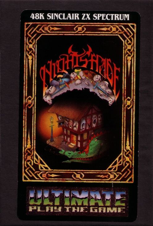
By the time Nightshade was released, the market was beginning to grow weary of Ultimate's obsession with isometric graphics. Though it featured a new version of the Filmation engine - which allowed for scrolling isometric visuals - the formula was still too familiar.
It's possibly no coincidence that it also boasts the most disappointing artwork of all the Spectrum big box releases - a medieval tavern painted with scary monster faces, and a dragon... making it a more obvious depiction of the in-game action. Similarly, the logo was a bit too fiddly, going overboard with its dusty skulls and swords.
"Yes, we get it," cried everyone. "It's a fantasy game."
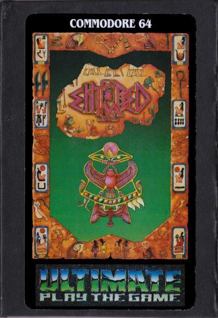
STAFF OF KARNATH
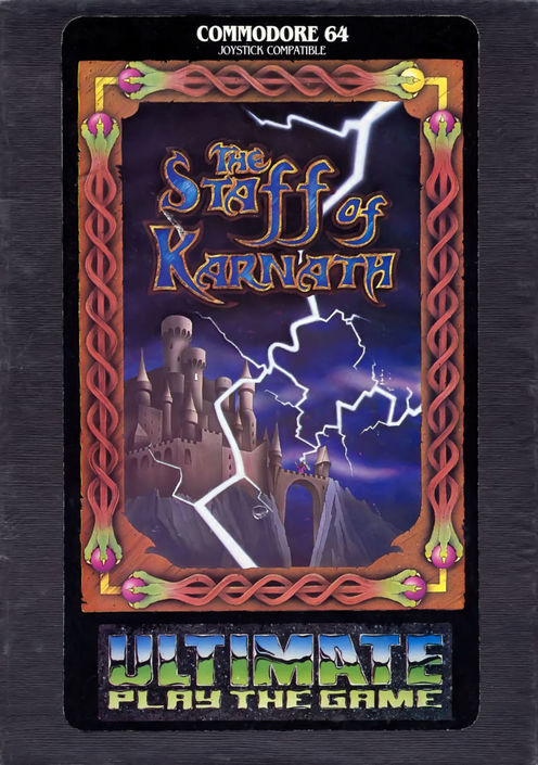
It's worth noting that Ultimate also tried its big box experiment with its broadly terrible Commodore 64 releases. However, the artwork was generally more on the generic side, as with Staff or Karnath, or - as with Entombed - featuring a completely illegible logo which appeared to have been designed by a "street artist" mid-seizure.
GUNFRIGHT
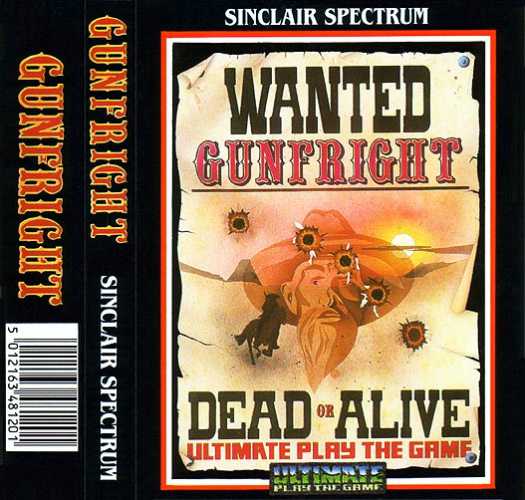
The final Ultimate game to be developed under the supervision of the Stamper brothers, Gunfright was also the first to be published by US Gold - the new owner of the company, best known at that point for releasing any old tat.
It marked the end of an era in more ways than one - not only ditching the big box packaging and artwork to save money (though not dropping the premium price), but also reducing the size classic Ultimate logo. So much for branding. It was the beginning of the end of the company, an ignominious end to a near-flawless run of goodness.
It marked the end of an era in more ways than one - not only ditching the big box packaging and artwork to save money (though not dropping the premium price), but also reducing the size classic Ultimate logo. So much for branding. It was the beginning of the end of the company, an ignominious end to a near-flawless run of goodness.
SEND AN EMAIL TO THE DIGITISER FRIDAY LETTERS PAGE!
[email protected]
[email protected]


 RSS Feed